Power BI’s Gauge visual is a champion for presenting data in a clear and captivating way.
Imagine speedometer-like dials instantly conveying performance against targets – that’s the power of gauges!
This blog post dives into common gauge limitations and equips you with solutions to create impactful visuals.

Gauge Advantages: Why They Shine
- Clarity at a Glance: Gauges efficiently showcase a single value with a range, making data trends and comparisons readily apparent.
- Visual Harmony: Combine gauges with other visuals like charts and tables for a well-rounded data story.
- KPI Champion: Gauges excel at displaying progress towards goals (KPIs), allowing you to monitor performance with ease.
Conquering Gauge Challenges: Solutions for Common Issues
While powerful, gauges can present a few hurdles. Let’s explore two common scenarios and their solutions:
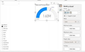
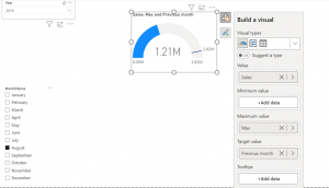
Challenge 1: Target Line Disappearing Act
The default gauge sets the “maximum value” (target) to double the current value. This can cause the target line to vanish if the previous month’s sales (target) are more than twice the current month’s sales.
Solution: Create a custom measure to dynamically adjust the maximum value. Here’s the logic:
- Check if the target is more than double the current value.
- If yes, set the maximum value to the target + a small buffer (e.g., 200,000) to avoid the target line merging with the max line.
- If no, set the maximum value to double the current value (default behaviour).
Challenge 2: Gauge Loses Focus When Filtered
Imagine using a gauge to compare regional sales against an overall average. When you filter by region, the gauge might only reflect that region’s performance, losing sight of the overall average.
Solution: Utilise the ALL function within a CALCULATE function to tell Power BI to ignore filtering for specific measures. This ensures the overall average remains displayed regardless of region filters.
Here’s how to adjust your measures:
- Overall Average (Unaffected by Region Filters):
Average all regions = CALCULATE(DIVIDE([Sales],DISTINCTCOUNT(Customers[Region]),0),ALL(Customers[Region]))
- Maximum Value (Unaffected by Region Filters):
Sales all regions = CALCULATE([Sales],all(Customers[Region]))
Conclusion: Mastering the Gauge for Impactful Data Communication
By understanding its strengths and overcoming limitations, you can transform the Power BI Gauge visual into a powerful tool for clear and impactful data communication. Remember, gauges excel at conveying key metrics and trends, making them a valuable asset for data analysis and reporting.
Further reading
Benefits of Using Power BI – blog
Improve Communication of Data Using Power BI Dashboards – blog