Here’s what’s New in Excel 2016
With the launch of Office 2016 in the Autumn of 2015, you may be wondering about the new features in 2016 and what’s changed. With Excel at the core of many businesses, it would help to have all of the new features explained. We have compared the different versions of Excel and come up with a quick overview of What’s New in Excel 2016.
To learn more about that, please take a look at our Excel courses.
Changes from Excel 2013
The main changes between Excel 2016 and 2013 are associated with the Business Intelligence (BI) features. They can be located on the Insert and Data tabs and include several new chart types, a Power Maps tool and a Forecast Sheet feature. There is also a new Get & Transform section for creating and working with queries.
The Tell Me box
‘Tell Me what you want to do’ on the Home ribbon is now available across Office 2016. Type what action you would like to take and you get some useful tips to help you get started. ‘Tell Me’ remembers what you have asked and further actions to try.
New Chart Types
On the Insert tab there are several new Chart Types available only in Excel 2016.
Waterfall
Box & Whisker
Treemap
Sunburst
Histogram – Pareto
Waterfall
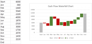
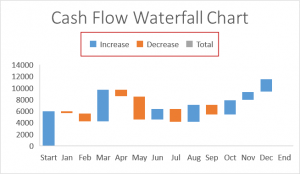
Being able to create a Waterfall chart with one click will amaze anyone who has attempted to create such a chart in previous versions of Excel. It would have involved a lengthy work around using formulas, recolouring bars, white boxs and adjusting the scale.
Recap: A Waterfall Chart, sometimes called a ‘flying brick chart’ is a way of visualizing a series of positive and negative data such as monthly cash flows. The bars appear to fly or float between the start and end columns giving the impression of a waterfall or a bridge.
Suppose you have the following data and wish to display it in a Waterfall Chart:
With Excel 2016 you click in the data and choose Insert, Waterfall from the Waterfall and Stock Chart button.
Some formatting is needed but most of the work is done.
See How to create a waterfall chart with Excel 2010
Treemap
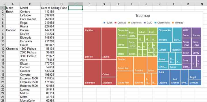
This is a brand new chart type and a great way to visualize hierarchies of data.
Suppose you have PivotTable data based on car sales. A Treemap can’t be created directly from a PivotTable so you will have to copy as values to another location. Now click in the data and choose
Insert, Hierarchy Chart, Treemap
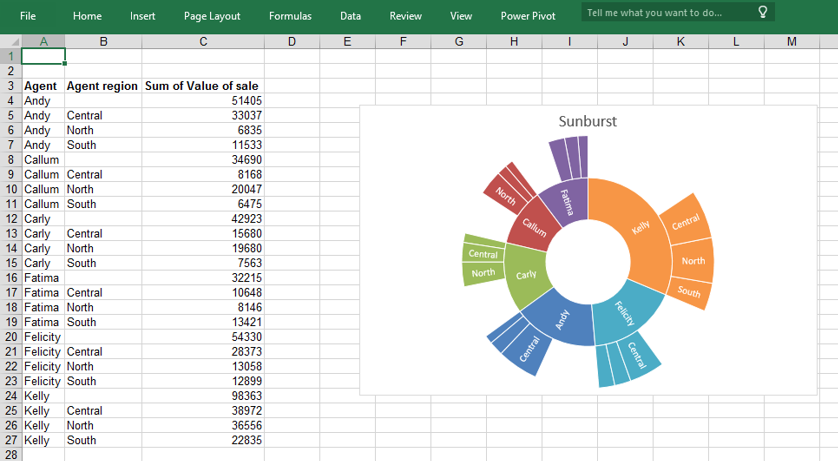
Sunburst
Another way to display this type of data is with a Sunburst chart.
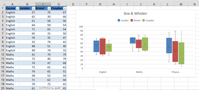
Box & Whisker
The Box & Whisker chart is used to show statistical information about a set of data. The line in the middle indicates the median value (middle value) while the bottom and top of the boxes represent the spread of the data from the first to the third quartile (25thpercentile to the 75th percentile). The lines extending vertically (whiskers) shows the spread of data outside this range.
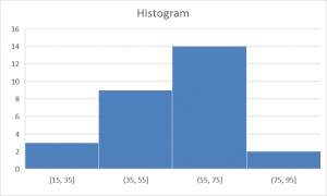
Histogram
From the same data you can now easily create a Histogram chart.
Right clicking on the axis and choosing Format Axis allow you to change the number of bars (bins) or the bin width.
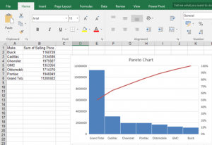
Pareto Chart
A Pareto chart displays a series of figures as a combination of a cumulative line chart and columns chart sorted in descending order.
Pareto Sorts your Bars: Highest first. This highlights which Bars have the biggest impact/return. This will influence your decision on where to assign your resources.
To create a Pareto chart, click in the data and select
Insert, Recommended Charts, Pareto
Power Map
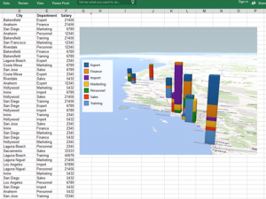
Now available on the Insert tab is Power Map. Click inside some data containing locations and a map is inserted onto a separate sheet as a new scene. Click the Add field button and Add Category to represent the data graphically.
The following graph can be created from data shown.
Click Layer Options to control bar thickness and height.
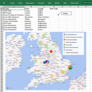
Power Map can also detect post codes. This UK map shows the location of training events based on post codes which have been hidden on this sheet.
Tip: To hide cells in an Excel worksheet Select the range of cells Right Click, Format Cells Select Custom and type ;;;””
The pie charts represent the number of events broken down by each course.
The maps are initially inserted onto a new sheet but can be copied back to an Excel worksheet by selecting a copy image button.
With Power Map you can even create a video to show a series of changes to a map over time.
Forecast Sheet
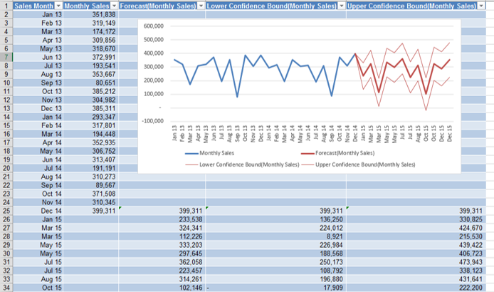
New to Excel 2016 on the Data tab is Forecast Sheet. This automatically creates formulas to make a forecast of your existing data.
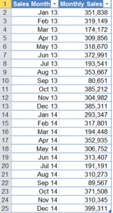
Suppose you have monthly sales pivot data for two years and wish to predict the next 12 months taking into account seasonal patterns if there are any. To create the sheet, click a cell in the table data and select:
Data, Forecast Sheet
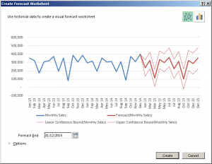
In the dialog box set the Forecast end date and click Create.
Next you will see a new sheet with forecasted data and a graph including upper and lower levels of confidence for the forecast.
Time Grouping in PivotTables
When creating PivotTables in Excel 2016, data containing date fields the dates will be grouped automatically.
Opening up Excel Workbooks with the New Charts on an Older version
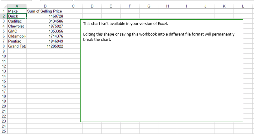
What happens if you are using Excel 2013 or 2010 and open an Excel 2016 workbook containing the new chart types or maps?
Rather than see the new chart you will see is a text box with a warning not to save your workbook into the older file format.
You may need to PDF workbooks containing the new chart types or cut and paste them as pictures if you want people with previous versions of Excel to view them.
What’s new for Excel 2010 users?
There are many people currently using Office 2010 and for those considering upgrading there will be even more new features to explore. Previously only available as Add-ins, Power Pivot, Power Query and Power View can now be accessed directly from the Excel 2016 ribbon.
Those who make use of these Business Intelligence tools will be working in new ways with Excel Tables and Table connections. Others will discover Slicers can be used with Tables as well as with Pivot Tables and many will find useful and fun ways to use Data, Flash Fill.
We wish you a happy Excel 2016 upgrade!
For more information on Excel training courses London, have a look at the full range of our courses.
One reply on “What’s New in Excel 2016?”
its difficult to use why we are sued to use previous versions,