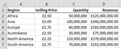
Excel charts are great visual tools to show changes in data. You can build dynamic charts in Excel with a few easy steps. Below is an example of a table which can be used to build an interactive chart.
The Quantity column’s values are simply entered into the cells, but the Revenue figures are the result of the formula =B2*C2, which is copied down the column. The Selling Price is generated by multiplying the Base Price (see below) with the Price Change showing in the drop-down list in H2 (also shown below, but more about the drop-down list later). The formula is: =F2+F2*$H$2. The $ symbols in the formula are used to lock the percentage in the formula when you copy it down, because it is only in the one cell.
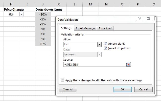
Select cell H2. To create the drop-down list, you need to have a normal list entered into some cells beforehand, as shown below. The drop-down is created by clicking the Data tab, then clicking Data Validation. In the box, select List from the Allow drop-down. Next, click inside the Source field, then select the list of figures in the cells (J2:J8 in this example). Now you have a drop-down list in cell H2.
As shown earlier, the figure shown in the drop-down cell (H2) is linked into the formula calculating the Selling Price. You can now change the Selling Price using the drop-down. And because the Selling Price is linked to the Revenue by a formula, these numbers also change!
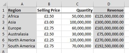
The final step is inserting a chart which shows the Regions and their Revenues. To do this, first select the regions (including the label). Then hold down the Ctrl button and also select the revenue figures, again including the label.
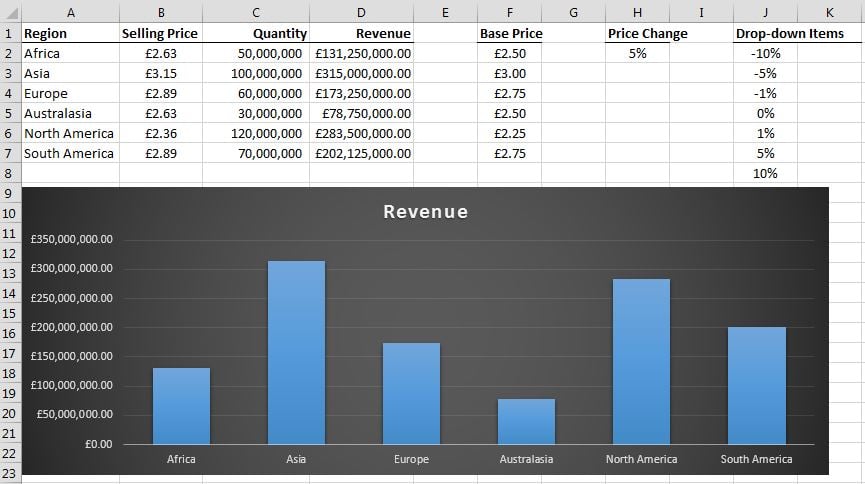
Now click the Insert tab, then click the Clustered Column option. This will insert a clustered column chart into your spreadsheet.
Move the chart to a suitable spot in your sheet, then test the drop-down list. See the magic happen as the chart changes when you select different values in the drop-down list!
Excel course is one of our Microsoft Office 365 training courses.


