By Ann K. Emery
With an estimated user base of 500 million people worldwide, many of us use Excel at work and personally for home budgets, projects, to-do lists, and more.
It doesn’t take too much use of Excel before you reach the point of trying to express your data visually. This is where Excel charting options and other tools are on hand to help you with data visualisation in Excel.
What’s the right chart for your data visualisation in Excel?
Should it be a pie chart, bar chart, line charts, exploded charts? Well fret no longer, and read on!
In this article, I share four strategies for effective data visualisation in Excel:
- Consult a chart taxonomy
- Surround yourself with visualization inspiration
- Sketch plenty of drafts by hand
- Explore preliminary patterns via computer
Your data will shine, you can stop banging your head against the wall, and your viewers will applaud the visual clarity you’ve provided.
Strategy 1: Consult a Chart Taxonomy
First, gather inspiration from a chart taxonomy. By taxonomy, I mean diagrams that classify chart types and help you decide which one to use.
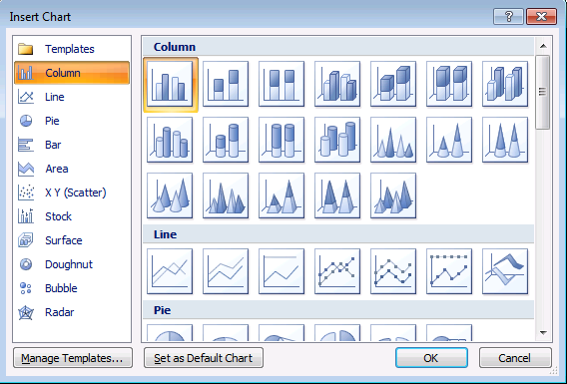
Excel’s Insert Chart Menu
This is the easiest taxonomy to use—the classic menu of Excel’s chart options that you’ve probably seen a million times before. The only problem is that some of these charts are, well, pretty rotten. Excel will suggest awful charts like 3D exploding pie charts and radar charts that are impossible to read and interpret. But, this menu is still a good starting point. And that’s where the additional taxonomies come in—to fill in the gaps.
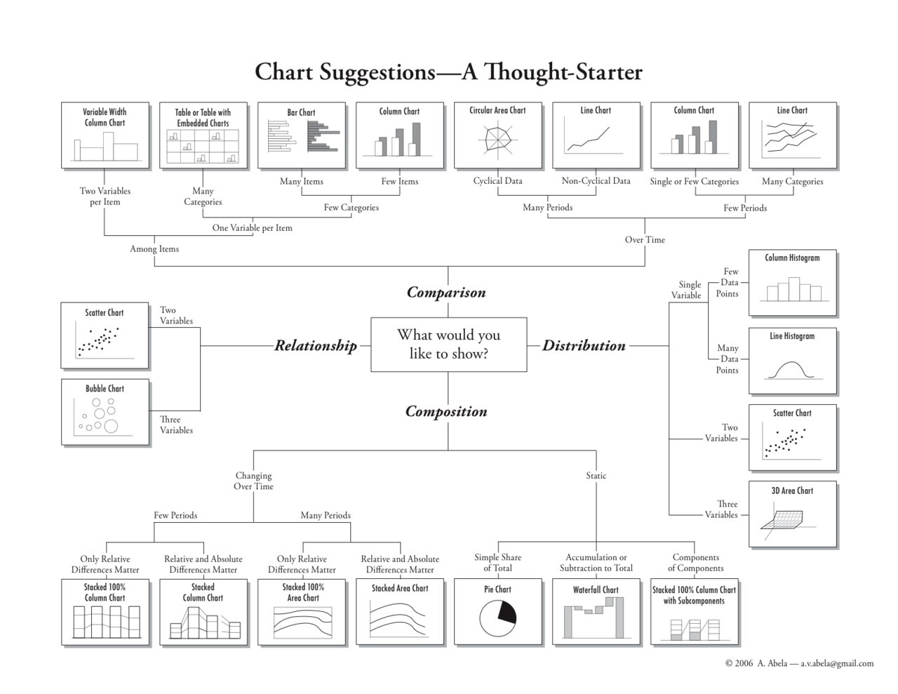
Chart Suggestions—A Thought Starter
Andrew Abela has a well-known Chart Suggestions guide on extremepresentation.com. This guide is wildly popular because he groups charts by function: comparison, distribution, composition, and relationship.
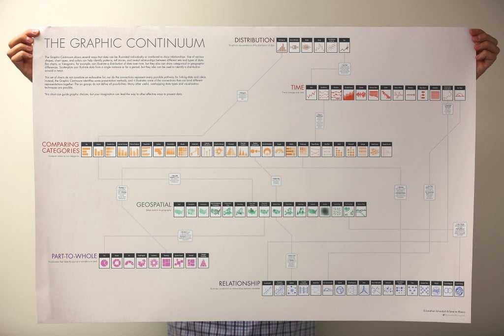
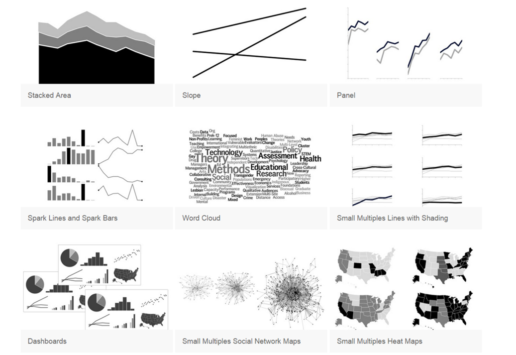
The Graphic Continuum
Jon Schwabish released the Graphic Continuum in 2014. The project began as a large poster—you can see him holding it up. He also created 8.5 x 11 inch laminated reference cards. Both the poster and reference cards are available on policyviz.com.
Essentials Chart Choosing Tool
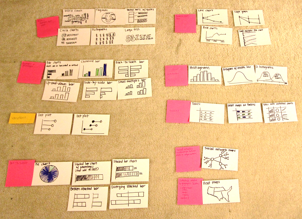
A year and a half ago I started designing my own chart taxonomy. I sketched all the charts I use on a regular basis on 3.5 x 5 inch index cards.
Then, I sorted, sorted, sorted, and sorted. I thought about which charts were best for displaying patterns over time, which charts were best for part-to-whole dynamics, and so on.
I tried rearranging my thoughts into a handout, a PowerPoint slide, and even mind-mapping software. I wasn’t satisfied with the static versions I produced. Last fall, the Essentials chart choosing tool was born.
You can use the filters to explore the chart types on your own, just like I had sorted the index cards on my living room floor. You might focus on charts that are ideal for patterns over time, or for graphing a dispersion or spread of data, or on charts that can be made within Excel.
Then, you can click on icons that interest you. Each chart has a separate page with a description, examples, and links to tutorials.
Strategy 2: Surround Yourself with Visualization Inspiration
Data visualization experts are constantly on the hunt for good examples.
On Twitter, I follow @NYTgraphics, @PostGraphics, and @PewResearch to ensure that my feed is full of strong visualizations.
On Pinterest, I store examples of everything from bar charts to computer-free visualizations, like charts made from stones, fruit, and paper.
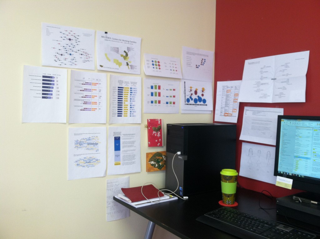
I also print full-page, full-colour charts and tape them above my desk. When I’m beginning a new project, I glance up at my gallery to get ideas for chart styles.
Strategy 3: Sketch Plenty of Drafts by Hand
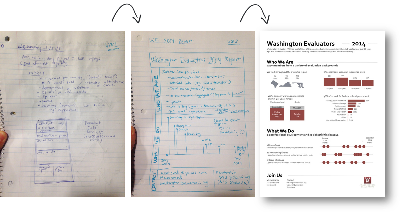
I also sketch, draw, and doodle plenty of drafts before I create anything on the computer.
Here’s how it works:
- Grab some scrap paper and markers, and then step away from the computer. Give your brain some creative time away from the screen rather than staring at a blank monitor.
- Set the timer for 10, 20, or even 30 minutes. Doodle as many drafts as you can. I aim for at least 10 drafts of each dataset. Only the best one will survive the editing process.
- Share drafts with colleagues early and often. Gather as much feedback as you can.
- Next, create one or two of those promising drafts on the computer.
- Edit, edit, edit! I adjust Excel’s default settings so that my charts follow the best practices outlined in the Data Visualization Checklist.
- Put your easiest-to-follow chart in your final presentation or report.
Strategy 4: Explore Preliminary Patterns via Computer
I also use quickie computer strategies, like Excel’s spark lines and conditional formatting, to help me narrow down the focus of my charts.
Spark Lines
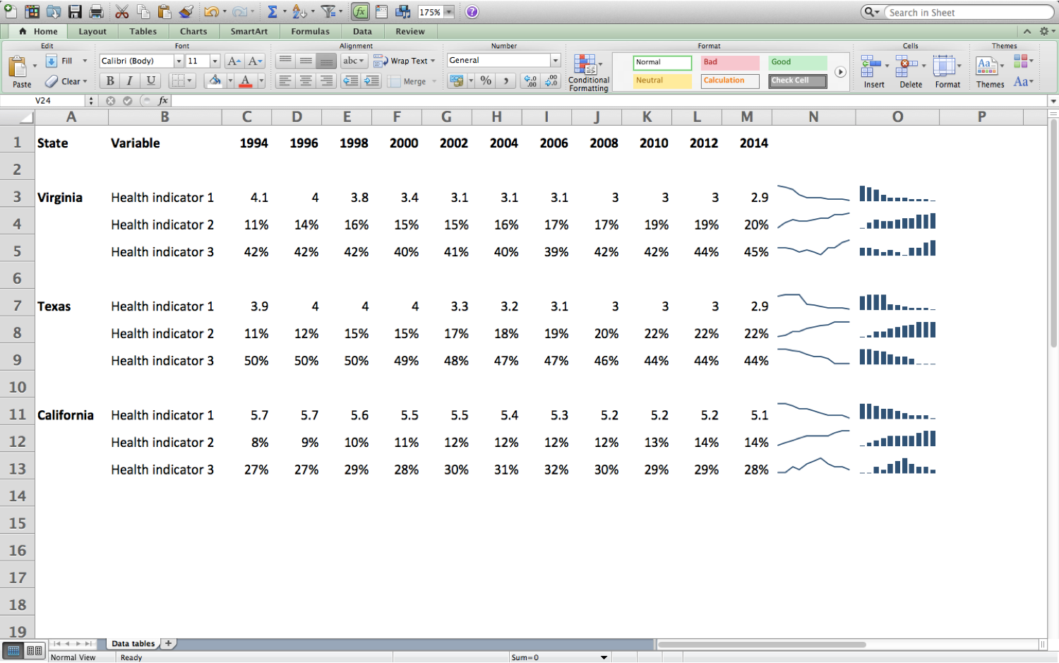
Spark lines are miniature within-cell bar charts and line charts. They’re available in Excel 2010 and higher on both PCs and Macs.
To insert spark bars or spark lines, highlight the row or column that you’re interested in, and then head over to Insert > Spark Line.
It takes a lot of mental energy to read each and every number in this table, so spark lines provide an instant glimpse at the highs and lows in my dataset. I use these insights to think about which patterns I might want to visualize in my final product.
Conditional Formatting
Conditional formatting is one of my favourite features of Excel. These features allow you to automatically colour-code your cells based on their contents.
To apply conditional formatting, highlight the rows or columns that you’re interested in, and then head over to Home > Conditional Formatting.
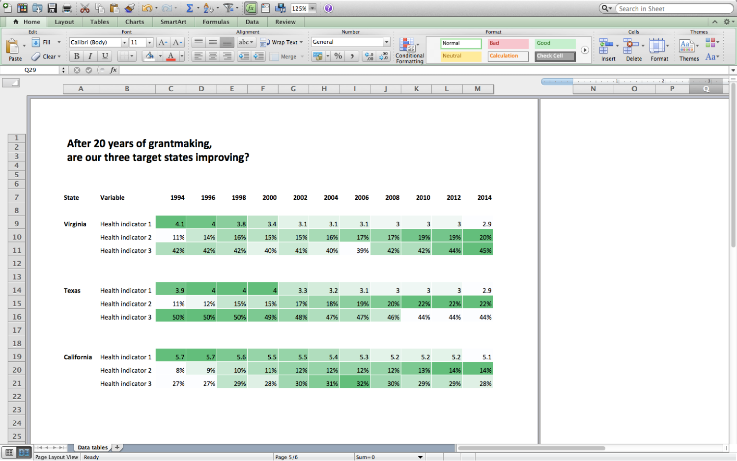
In this example, I turned my regular table into a heat table using Colour Scales. The larger numbers automatically get coloured in with darker colours and the smaller numbers get coloured in with lighter colours. Now, I can spot the highs and lows in my dataset instantly.
Sometimes I use these heat tables as inspiration for future charts, that is, to locate patterns that should get emphasized in other bar charts or line charts.
Other times, these heat tables are my final product. As shown below, I added a title and made this table printer-friendly. Then I can print the colour-coded table and share it as a handout at a meeting.
What are your strategies for selecting the right chart for your dataset? Please share your tips in the comments section below and for the best Excel training courses have a look at the full range of our courses.
