In a commercial environment you’re probably aware of the ever-deepening sea of paperwork that lands in your inbox or on your desk. Over time we develop skills in picking out key points from the entire document, but over time we also become passive viewers of content both at work and in our personal lives. How often do you challenge an advertisement you see, and how often do you actively de-construct documents you get at work without skim reading?
In this article I aim to outline five key functions you can use in Microsoft Word to make your readers actively digest the information you are trying to portray. Regardless of your profession you should be able to incorporate these features into your documents.
1. Visual Stimulants in your documents:
Keeping your readers engaged with coherent and engaging copy is obviously very important, but displaying that in a way which isn’t text heavy can be difficult. However here are just some tools you can use to maximize the visual engagement of your document:
Flowcharts instead of words:
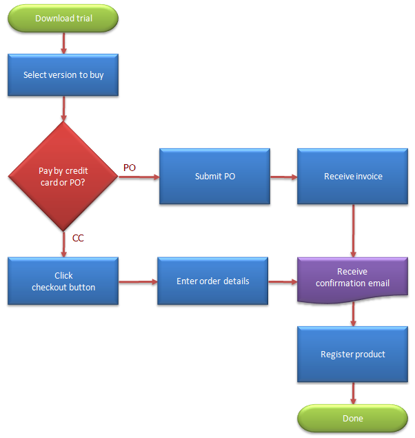
You’ve been asked to outline a project workflow when conceptualising a new service that your company plans on offering to its customers. Flowcharts will allow you to break up dense sections of copy into visually appealing, and fluid, structures. Not only do they encourage you to keep your copy concise but they also arrange your copy in a way which instantaneously makes the project’s stages linear and organised.
SmartArt process graphics:
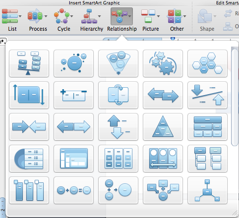
These will allow you to essentially follow the same principles that a flowchart has to offer. However it offers a much wider variety of ‘SmartArt Graphics’ and layouts to display not only text but images, processes, cycles and hierarchy structures. Each one of these SmartArt Graphics contain their own self expanding menu, allow you to select from a dazzling array of pre-built options which will ultimately keep your documents original.
2. Formatting text:
There is nothing worse then reading trough several pages of dense copy. Subconsciously your brain will immediately start looking for well structured visual paragraphs and sentences. A decent understanding of paragraph formatting and basic grammatical practices are important, but this doesn’t mean you have to have a PhD in English Language to form a well-structured document! Try using the following tools:
Text Box:
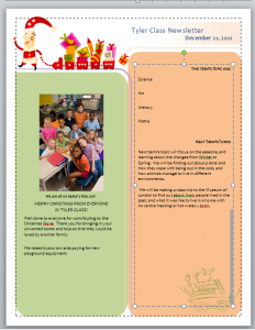
A feature that has been an integral part of Word for many years now, and arguably a tool that hasn’t changed since its conception and for good reasons too. The Text Box tool allows you to place segments of concise text anywhere on your page, for example you may have an image that needs more of an explanation than a mere caption. The Text Box tool will also allow you to format its appearance by altering its border type, colour and size.
3. Multimedia content:
If you’ve read my other article on Cloud based storage you would have picked up on the ever growing consumer reliance on being able to not only store but view digital files wherever they may be. Therefore you are able to utilise these multi-media tools in Word to effectively incorporate your brands assets including your logo, promotional video and even an audio file.
Videos:
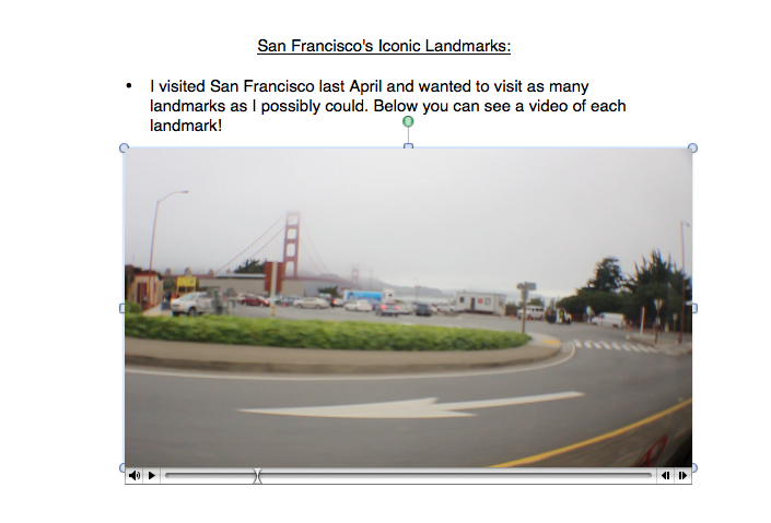
The most interactive form of communicating a message, however not every document would require a video file to be produced and incorporated. However if you have a launched a new service, or product, you may want to film the response of your clients which could then be attached to your monthly review of said service. Initially however it isn’t immediately obvious how to play a video file if you have shared the document directly, to play the file you have to double click its icon which will then bring up its command bar.
Audio:
Word doesn’t shout about this feature, however it’s something that can be used extremely effectively given most situations. To use my previous scenario some customers/clients may be uncomfortable with filming their response to your new product. However by offering a follow up meeting to receive this invaluable feedback you could effectively kill two birds with one stone. If your client were happy to record the meeting in an audio format, you would be able to gain accurate and quotable comments as well as being able to directly import this audio into commercial reports.
4. Fonts and Font Sizes:
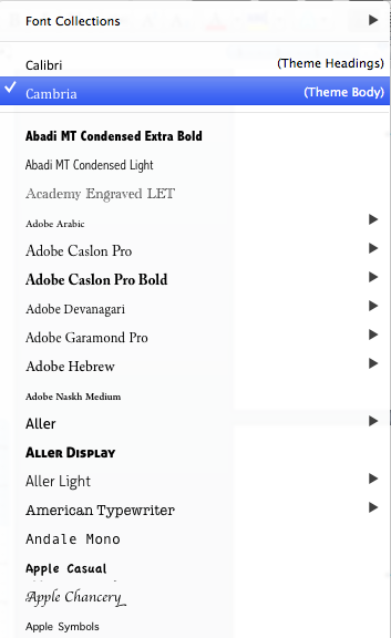
Something that is quite easily over looked when writing your articles, I’m sure that you have probably come across lengthy documents in size 8 font in the past. There seems to be a tendency in some people to try and bloat a document with as much copy as they can, normally resulting in detraction from the readers intended outcome. Again you brain will be telling you that reading 5000 words in size 8 font is going to be a struggle, so settle for a minimum of size 12. Also try to avoid flamboyant type faces, but try to select one which avoids the standard Times New Roman or Arial to make your document stand out from the others your boss will receive.
5. Connectivity:
We are always striving to expand our knowledge in areas that interest us, however reading through commercial sales reports and staff reviews don’t overly tend to engage our imagination. You can change this though, as I said before in my Cloud based storage article more and more people are consuming media on digital devices. This can allow you to add endless connectivity to your documents; one way to do this is to incorporate hyperlinks. This would allow your readers to expand their knowledge in competing companies, as an example, you could reference a video game trailer for a product from a rival publisher. This would not only inform your boss of competing brands but also allow them to engage with the content.
By simply utilising some of these tools in Word you can effectively add a new lease of life into your documents. What do you think, are these techniques really something you think could make a difference? Or do you think that most commercial organisations wouldn’t want to allocate more time into making their documents more engaging?
Want to use Word like a pro? Find out more Best STL Word Training Courses London and UK wide.
