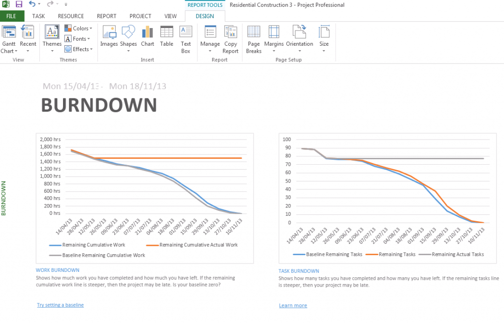
The burndown report is a much-requested feature that will be especially interesting to those of you practicing agile and Scrum-based methodology. Typically updated every day, this report is a common focal point of the daily scrum meeting.
Previously to see a burndown chart you had to employ some hacks and Excel templates to achieve the desired result. From Project 2013 it’s available as a standard report type.
Burndown charts in Project 2013
Select Report > Dashboard > Burndown
Usually the chart tracks work remaining (in time, effort points or quantity of tasks) against the date. One line represents how much work has been completed, a baseline of when to complete and the ‘perfect’ trajectory of task completion.
How is this chart useful?
Instead of tracking the amount of things done, the burndown chart reports on the amount of ‘effort’ or work left in the project phase. In other words you are ‘burning down’ the work. It will also predict based on current work rate whether the project will hit the target completion date. You’ll discover very soon whether the team is working at a fast enough rate. It’s great to get advance notice of how things are progressing and be able to adapt your project or adjust expectations sooner rather than later.
It can also be used to see whether a project team is over-performing and going to finish early. While this is usually good news this information can prove very useful in your next post-mortem. Do the team need to work on their task estimations? Or was the work completed to a less acceptable standard?
Find out more great advice like this with a Best STL course on Microsoft Project training London and UK wide.


