Finally, there are new advanced options to create forecasting models in Power BI. Microsoft introduced the LINEST function and LINESTX function in the Power BI desktop February 2023 version.
The LINEST function in Excel has always been an important tool for perform linear regression, leveraging the Least Squares method, to calculate a straight line that best fits the given data. The functions are especially useful in predicting unknown values (Y) given known values (X) and can work with any number of X columns.
In this blog post, we will use the LINEST function as our example. The LINEST function creates a table with a single row explaining the line and additional statistics. The table includes the columns slopes, intercepts, standard errors, and the coefficient of determination.
All the information needed for the equation of the fitted line can be constructed: Y = Slope1 * X1 + Slope2 * X2 + …+ Intercept.
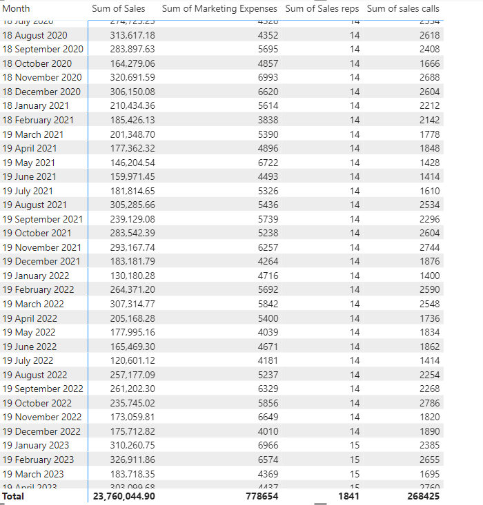
In this example the data set is sales data. It include total monthly sales, how many sales reps, monthly marketing expenses, and monthly number of sales calls.
The Power BI report should visualise how future changes in number of sales reps, sales calls, and marketing budget will affect the future sales.
The LINEST function
Syntax
LINEST ( <columnY>, <columnX>[, …], [<const>] )
Parameters
To create the LINEST table click New Table on the Modelling tab. In this example, we will use three X values.
Linest result = LINEST(‘sales stats'[Sales],’sales stats'[Marketing Expenses],’sales stats'[sales calls],’sales stats'[Sales reps])
This DAX return a single row table including a lot of statistics, but in this blog post, you will only see how the y-intercept and sloop is used for predictions.
The linear regression equation:
Y = Slope1 * X1 + Slope2 * X2 + …+ Intercept.
The DAX will look like this in this model:
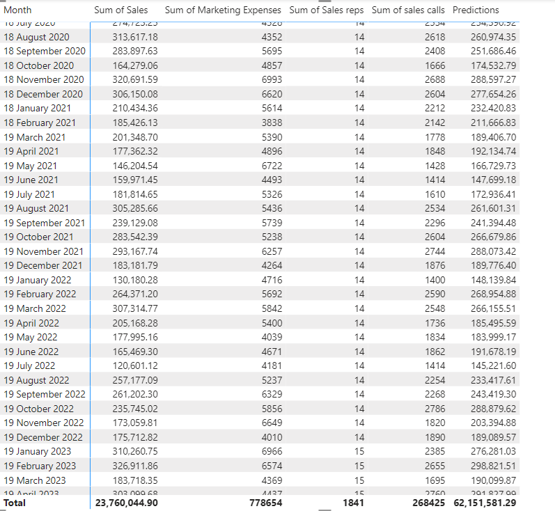
Predictions = sum(‘Linest result'[Intercept])+SUM(‘Linest result'[Slope1])*SUM(‘sales stats'[Marketing Expenses])+sum(‘Linest result'[Slope2])*sum(‘sales stats'[sales calls])+SUM(‘Linest result'[Slope3])*SUM(‘sales stats'[Sales reps])
The DAX measure is added to the matrix to give an indication of the accuracy.
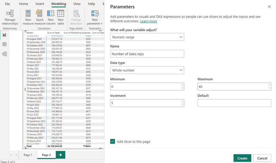
To give the audience an option to predict how changes will affect the sales, parameter tables can be used. Click New parameter on the Modelling tab, add the parameters, and click OK.
The New Parameter tool creates a table with the parameter values and a slicer. Therefore, the audience can select the parameters.
Next step will be to write the DAX to show the prediction based on selected parameters.
Again, the linear regression equation:
Y = Slope1 * X1 + Slope2 * X2 + …+ Intercept.
The sloop values and the intercept are in the Prediction table the LINEST function created earlier in this blog post and the X values will come from the three parameter slicers.
The DAX will in this example look like this:
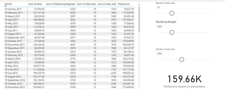
Predictions based on parameters = sum(‘Linest result'[Intercept])+SELECTEDVALUE(‘Marketing Budget'[Marketing Budget])*SUM(‘Linest result'[Slope1])+SELECTEDVALUE(‘Number of sales calls'[Number of sales calls])*sum(‘Linest result'[Slope2])+SELECTEDVALUE(‘Number of Sales reps'[Number of Sales reps])*sum(‘Linest result'[Slope3])
We can use the SELECTEDVALUE function to return the selected values from the slicers.
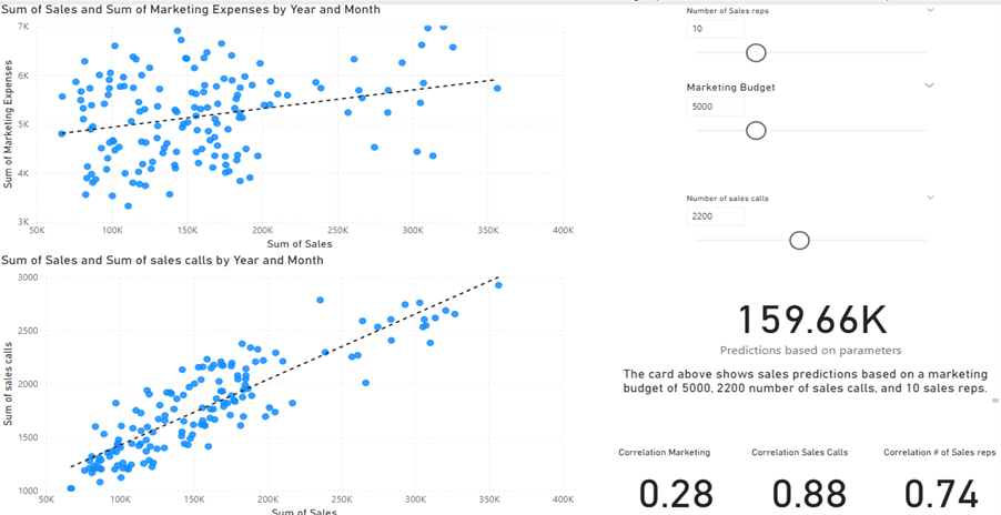
The measure is here added to a Card visual to visualise the result.
In a forecast model like this it could be useful to investigate how much or if the X values (marketing budget, number of sales calls, and number of sales reps) affect the sales.
You can find a particularly useful Quick Measure, which can tell you this, the Correlation Coefficient quick measure.
You will here see how the correlation is calculated between the Sales and Marketing Budget.
The DAX will look like this, but you will not need to write it yourself.
Sales and Marketing Expenses correlation for Month =
VAR __CORRELATION_TABLE = VALUES(‘sales stats'[Month])
VAR __COUNT =
COUNTX(
KEEPFILTERS(__CORRELATION_TABLE),
CALCULATE(
SUM(‘sales stats'[Sales])
* SUM(‘sales stats'[Marketing Expenses])
)
)
VAR __SUM_X =
SUMX(
KEEPFILTERS(__CORRELATION_TABLE),
CALCULATE(SUM(‘sales stats'[Sales]))
)
VAR __SUM_Y =
SUMX(
KEEPFILTERS(__CORRELATION_TABLE),
CALCULATE(SUM(‘sales stats'[Marketing Expenses]))
)
VAR __SUM_XY =
SUMX(
KEEPFILTERS(__CORRELATION_TABLE),
CALCULATE(
SUM(‘sales stats'[Sales])
* SUM(‘sales stats'[Marketing Expenses]) * 1.
)
)
VAR __SUM_X2 =
SUMX(
KEEPFILTERS(__CORRELATION_TABLE),
CALCULATE(SUM(‘sales stats'[Sales]) ^ 2)
)
VAR __SUM_Y2 =
SUMX(
KEEPFILTERS(__CORRELATION_TABLE),
CALCULATE(SUM(‘sales stats'[Marketing Expenses]) ^ 2)
)
RETURN
DIVIDE(
__COUNT * __SUM_XY – __SUM_X * __SUM_Y * 1.,
SQRT(
(__COUNT * __SUM_X2 – __SUM_X ^ 2)
* (__COUNT * __SUM_Y2 – __SUM_Y ^ 2)
)
)
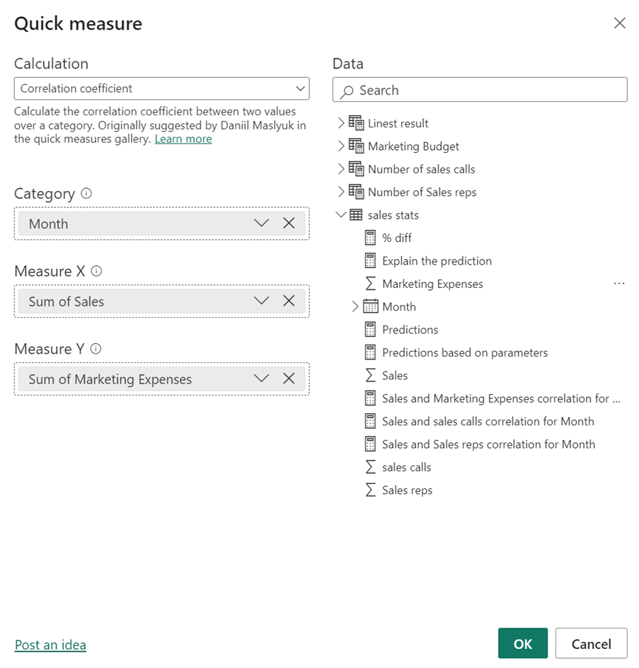
You just need to click Quick Measure on the Home tab and then add the parameters from your tables. In this example it will look like this, Power BI desktop will write the DAX:
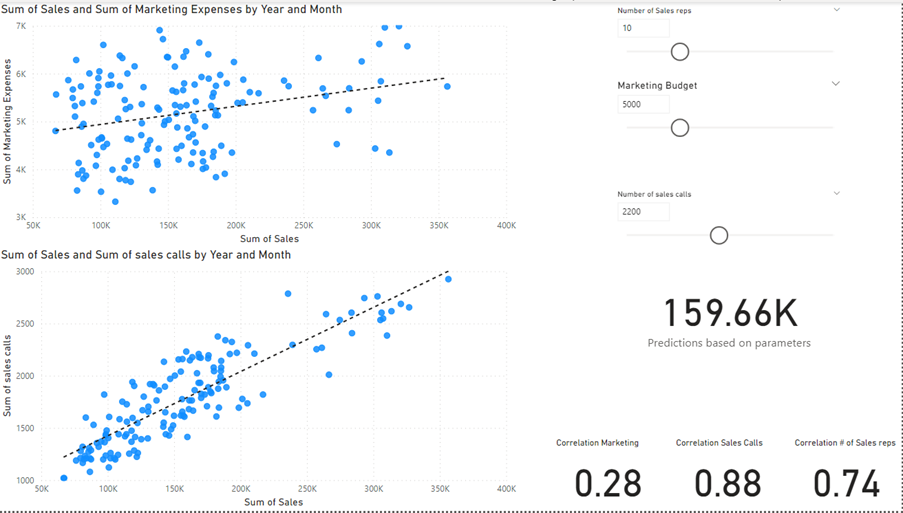
You will see here that this Correlation Coefficient measure returns 0.28. This means that we have a positive correlation. That is to say our sales have improved when we have spent more money on marketing. However, the number is disappointing. There is an almost non-existent relationship between Sales and the Marketing budget . It is suggested here that when your company spends more money on Marketing, the sales increase comparatively poorly.
The correlation between Sales and Number of Sales calls, and the Correlation between Sales and Number of Sales reps are also calculated in this model and these results are much more satisfying.
Based on the correlation between the X values I would remove the Marketing Budget from my Prediction measures to get a more accurate result, or I would find a better way of using the budget.
We can visualise correlation measures on Scatter charts, and it is obverse that the relationship between Sales and calls are much closer than the relationship between Sales and Marketing Expenses.
I will end this blog post by also create a dynamic text DAX measure to describe the prediction displayed in the card. This text DAX text result will appear in a text box.
The DAX
Explain the prediction = “The card above shows sales predictions based on a marketing budget of ” & SELECTEDVALUE(‘Marketing Budget'[Marketing Budget]) & “, ” & SELECTEDVALUE(‘Number of sales calls'[Number of sales calls]) & ” number of sales calls, and ” & SELECTEDVALUE(‘Number of Sales reps'[Number of Sales reps]) & ” sales reps.”
By adding this DAX to the title of a Text box, you will create a dynamic Text box, which will show selected values from the slicers.
You can find the dynamic Text box to the right just under the Card with the prediction. The text box will display the values you can see, and you can select them from the slicers.
Conclusion
I have missed some more advanced data analysis tools in Power BI desktop. I really appreciate that we now getting more options. It was possible to calculate the slope and intercept before we got the LINEST function, but it was a nightmare. I did ones calculate the slope, but the DAX was a endless number of DAX and very time consuming. Well done Microsoft and please keep on the good work.
