How to create AND split a stacked chart in Excel
Amongst the many charts available in Excel, some of the most popular are column charts, and the main variants being clustered and stacked. We’ll look at how to split a stacked chart in Excel, and to do this let’s start by creating a basic column chart.
Creating a column chart
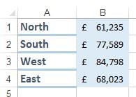
In this example we are looking at regional sales data.
Let’s create a clustered column chart of the above data.
Step 1 Select the range of data (as above, which will be A1:B4).
Step 2 Now select chart type, and “Clustered Column” from Charts options on the Insert ribbon.
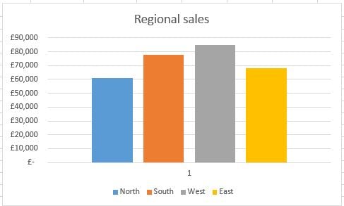
Step 3 The following chart is now created.
This is all well and good we can compare regional sales performance, but it’s not so easy to compare how well each region performed against total sales. That’s where stacked column charts come into their own, let’s see how to build one.
Creating a stacked column chart
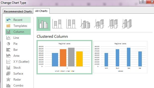
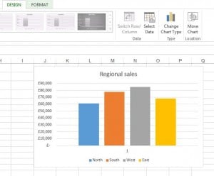
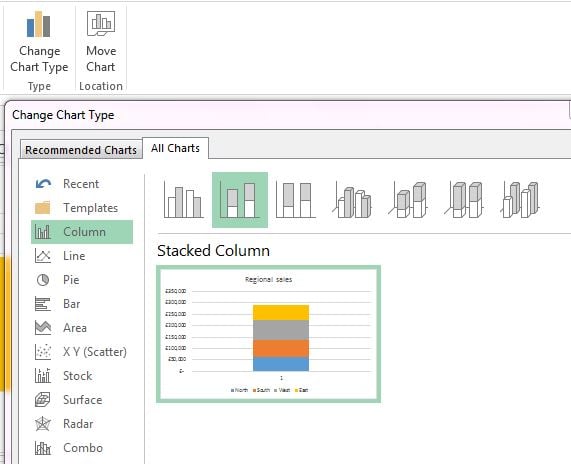
Step 1 Simply select the above chart then choose “Change Chart Type” from the Design ribbon.
Step 2 In the “Change Chart Type” dialogue box just choose the “Stacked Column” option as below.
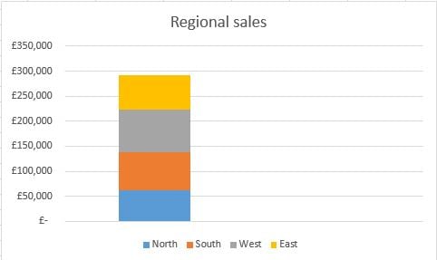
We now have a single stacked column chart for regional sales.
How to split a stacked chart in Excel
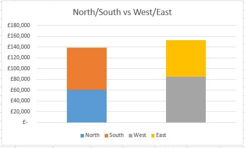
Now supposing we want to compare North & South as a stacked column against West and East as a stacked column. This can be achieved by splitting the above stacked chart.
Step 1 We need to change the layout of our data. So in this case we are going to select the two cells containing the “West” and “East” sales figures, then move them one column to the right. See below.
Step 2 Now select the new range of data, in this case A1:C4, and as before when creating our original column chart but this time selecting the “stacked column” option. We end up with the following.
We now have our regional sales in a split stacked column chart.
By learning how to split a stacked chart in Excel you can now visualise data in a new and useful way.
More Excel chart related information:
How do you add a piechart and a bar / column chart on one worksheet?
Read more
How do I create a Floating Column Chart in Excel?
Read more
Excel 2013: 3 new ways to customise your charts
