Tooltips pages can add visually powerful information to your reports and dashboards. Not only are they visually stunning, they’re also incredibly simple to implement! Follow our guide below to enhance your Power BI dashboard, and instantly reap the rewards of greater analytical power.
An Example of Tooltips:
The tooltips will appear when you hover over visuals and will add important, highly visual additional information to the page.
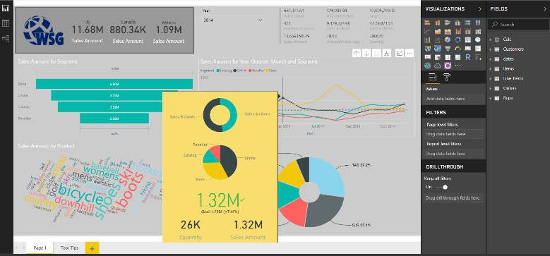
The image below shows an example of the tooltips, when we hover over May in the line chart.
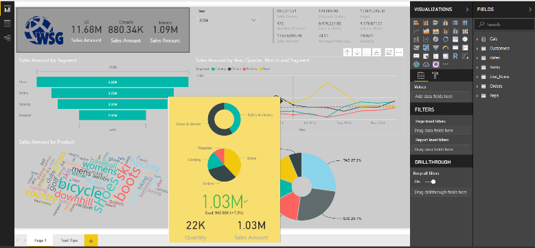
If we move the mouse curser over June, the key information for June will be displayed as tooltips (see image below).
The tooltips page can include visuals, text boxes, images, and any other options or items normally included in a Power BI report. These options are selected and controlled by you when setting up the tooltips.
There are no limitations of how many tooltips pages you can create. You can control which tooltip pages are shown when you hover over visuals in your report, and the tooltips will simply be filtered by the data you point at with your mouse curser.
How to Create a Report Tooltip Page
1) Create a new page in your Power BI report and size it to the proper size for a tooltip.
You can do this on the Format pane in the Page Size card. If you click on the down arrow under Type, you have an option to size it to default tooltip size, but you can also customise the size. The canvas you get will not give you the right feeling of the size before you change the page view to actual size. To do this click on the View tab Page View and Actual Size.
2) Decide which visuals and objects you want to have on your tooltip page.
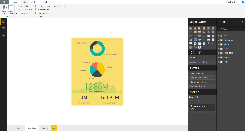
Below you will see an example tooltip page, where a donut chart shows the sales amount for VIP clients and normal clients. You can see a pie chart showing sales amount for segments, using the KPI visual to visualise targets. There is a card showing quantity, and a card showing sales amount.
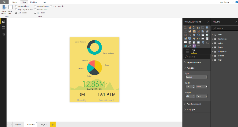
You can set up the options for your own tooltips page in the same way, just choosing the most essential features for your report.
Setting Up and Configuring the Tooltip Page
You need to configure two options to get Power BI to show your tooltip page when you hover over the visuals in your report. You will also need to define which tooltips you want to appear when you hover over a specific visual.
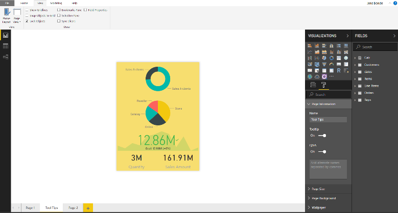
First, you need to turn the Tooltip slider to On, in the Page Information card, to make the page you created a tooltip (see below).
The next step is to define the fields you want the tooltip to display. Select the visuals in your report that contain the field you specify, and the tooltip will appear.
You can tell Power BI which field or fields to apply by dragging them into the Tooltip fields bucket, which you can find in the Fields section of the Visualizations pane. In the image below, the Sales Amount field has been dragged into the Tooltips fields bucket.
There can be either categorical, numerical or measures fields in the Tooltips fields bucket.
When this has been done, your chosen options will automatically substitute the default Power BI tooltip.
Configure the Tooltip Manually
Alternatively, if you can find a Tooltip card in the visual’s Formatting pane, you can get the tooltip to appear when you hover over the visual. Please note: not all visuals can display tooltips.
Select the visual you want to setup. In the Visualizations pane, select the Format section and expand the Tooltip card. Select the tooltip report page you want from the dropdown for the visual.
Unfortunately, tooltips setup for custom visuals will not appear on mobile devices.
Conclusion
Tooltips is a new feature in Power BI that can quickly and easily improve the usability and aesthetics of your reports. Use it effectively and you elevate your analytical power to the next level.
For more information, tips and techniques, check out our Power BI Training Course.