This is another thing I didn’t realise that Powerpoint could do.
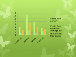
Using my garden project presentation, I want to add a basic chart from scratch that compares the costs of sourcing plants from a nursery, from donations or cuttings, or a combination of the two.
Luckily, Powerpoint led me through the process for adding basic information to make bar chart.
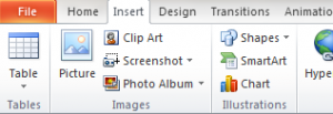
I clicked on the Insert tab and selected Chart, which is located in the Illustrations menu.

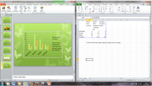
When I selected the bar chart, Powerpoint opened up an extra screen with the key headings for my chart. I then added the data I wanted. The chart was updated as I worked.


This is a really simple example of inserting Excel data into a Powerpoint presentation, using new data. It’s a good start, and now I really want to build on that…time for more exploring….
For more advanced techniques in Excel and Powerpoint courses, take a look at our range of courses, from introduction, intermediate and more https://www.stl-training.co.uk/powerpoint-training-london.php and https://www.stl-training.co.uk/microsoft/excel-training-london.php
| excel and powerpoint courses |