Sparklines are small charts that fit into a cell in your Excel workbooks. They act as a great visual summary of trends that use a small amount of space and allow you to make quick and effective comparisons in the blink of an eye.

Features
- Sparklines will actively update as you add new data.
- Sparklines are printed when you print a worksheet that contains them.
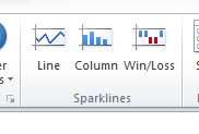
- There are three types of Sparklines: Line, Column, and Win/Loss.
- You can use sparklines to show trends in a series of values, identify minimum and maximum values, business cycles, customer demand over a quarter…and so much more.
- They are located in the Insert tab
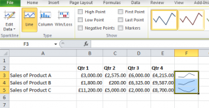
- You can customise them using the Design tab
- You can copy the format into other cells using the autofill handle

How to add a sparkline
- Select the cell or multiple cells where you want to create your Sparkline.
- Go to the Insert tab, and in the Sparklines group, click the type of sparkline that you want to use. Remember, there are three styles to choose from: Line, Column, or Win/Loss.
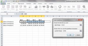
- Excel will give you a prompt for you to enter a Data Range you are using to create the Sparklines.
- Enter your data range, or click and drag to choose your data range. Then add the cell details where you want the sparkline to appear.
- Click OK .
- Excel will then show you the Sparklines in your selected cells.
- If you want to copy this sparkline format to other cells, use the autofill handle.
- Ta da!
Sparklines are very simple to apply and can give you a quick snapshot of data – this can be great if you are asked for a quick update on trends in a meeting. You can get more out of Excel including advanced techniques from Microsoftnet Excel VBA training https://www.stl-training.co.uk/vba-training-london.php

