Data visualisation is a powerful tool that allows you to view data more clearly. This is vitally important for businesses to help them with crucial decision making.
What is data visualisation?
Data visualisation is the process of turning raw data into graphical representations. It works by taking selected data in Excel and then choosing from a variety of different charts the one that is best suited to the data. These charts can make it easy to communicate trends in data and draw conclusions.
How can data visualisation help businesses?
Data visualisation can help businesses make better decisions through identifying key trends, patterns, and outliers in their data. In turn, it can help them communicate insights to stakeholders more effectively.
Tutorial
Charts in Excel can be created in two different ways depending on the complexity of the data. The first method is to make a chart from a simple dataset and is always a good place to start if you have this data already available.
The second method is to convert a more detailed transactional dataset (e.g. daily sales transactions) into a PivotChart (a visual equivalent of a Pivot Table). This method is ideal for converting ‘raw’ data into summary reports and provides more scope for greater insights.
On the other hand, the first method is more suited to data that has already been summarised but is more limited in showing insights. This blog will show both approaches starting with the first method as it is the simpler of the two to master.
Creating a Chart (first method)
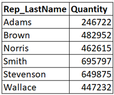
Let’s say an Area Manager is tasked with comparing the sales performance of Sales Reps in terms of quantities of products sold. The Excel table below contains the summary totals for each Rep:
1. Provided there are no blank rows or columns
within the dataset, you can just select any cell
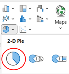
in the data and go to INSERT > PIE CHART ICON
2. Select the 2-D Pie icon
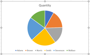
3. The Pie Chart will now appear – see below:
Editing a Chart
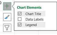
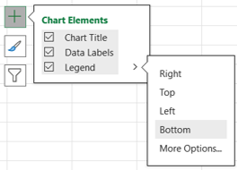
The ‘Chart Title’ and ‘Legend’ (Colour key for a category list) are 2 of the 3 ‘Chart Elements’ that go to make up a Pie Chart. The 3rd element is ‘Data Labels’ which can be displayed using the ‘Chart Elements’ icon:
- Click on the icon and tick the box for ‘Data Labels’
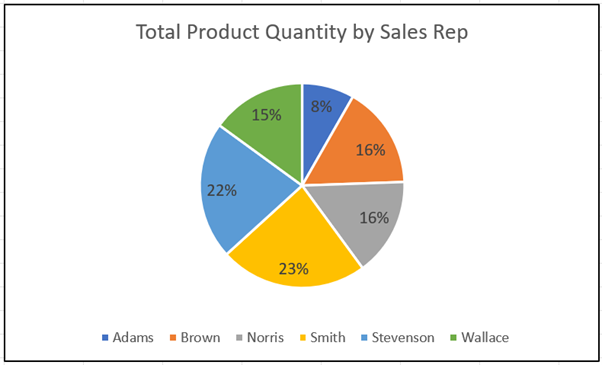
- With the ‘Chart Title’ box ticked, select the text ‘Quantity’ and type ‘Total Product Quantity by Sales Rep.’ This is a ‘free’ text box that allows you to enter your own customised text
- With the ‘Legend’ selected, hover to the right and you will see a > icon. Select ‘Right’ to move the legend to the right-hand side of the Chart
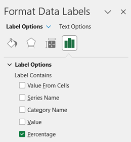
- To add percentages to the Chart, go to the ‘Chart Elements’ icon and then DATA Labels – More Options.
- Note a list of tick boxes to display different ‘Label Options’. Tick ‘Percentage’ and untick ‘Value’ in the list
The result of all these changes can be seen below:
Creating a PivotChart (second method)
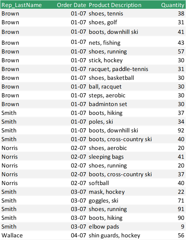
The same Area Manager now wants to see more details in the Sales Reps’ performance e.g. Sales broken down by Individual Rep and Product. As the original dataset used in the first method only contains quantities by Rep, the Area Manager will need another more detailed set of data – a section of the data is shown below:
Ensure the data has headings for each column and there are no blank rows or columns within the data itself.
-
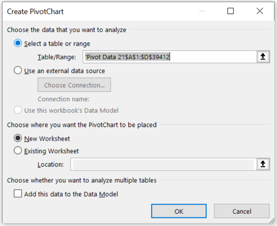
- Select the PivotChart and go to PIVOTCHART ANALYSE > INSERT SLICER and tick for Product Description Select any cell within the data and go to INSERT > PIVOTCHART > PIVOTCHART (sub-list) The following dialog box will appear:
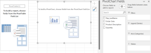
Ensure all data is referenced in the ‘Table/Range’ field and then click OK. This action creates a new sheet with 3 objects: PivotChart, Pivot Table and PivotChart Fields pane:
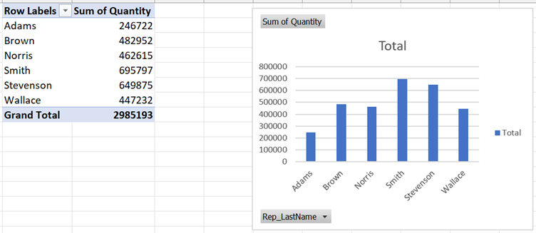
Think of the PivotChart Fields pane as the ‘control panel’ used to build the PivotChart and PivotTable - In the Field List, tick the fields for Rep_LastName and Quantity to produce the following visuals:
Notice that the default settings are to Sum the Quantities and create a ‘Column Chart.’ - To change it to a Pie Chart, select the chart and go to DESIGN > CHANGE CHART TYPE, select the Pie Chart option and click OK.
- Add Data labels and set them to Percentage as covered in the second method.
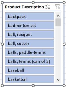
- To analyse sales broken down by Product, you can create a slicer (visual filter):
Select the PivotChart and go to PIVOTCHART ANALYSE > INSERT SLICER and tick for Product Description
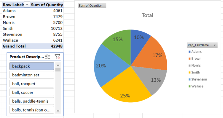
- Now click on an individual product (e.g. backpack) and notice how it interacts with the PivotChart and PivotTable:
- Select the PivotChart and go to PIVOTCHART ANALYSE > INSERT SLICER and tick for Product Description Select any cell within the data and go to INSERT > PIVOTCHART > PIVOTCHART (sub-list) The following dialog box will appear:
Industry sector examples
Examples of data visualisation from other industries could include:
-
-
- HR Managers analysing number of sick days across departments
- Data Analysts in healthcare checking patient attendance for different types of medical treatment
- Events Coordinators tracking cost/revenue of events on a monthly basis
- Customer Service Managers analysing call volume, call times and customer satisfaction scores generated from helpdesk data
-
Conclusion
Data visualisation is key to understanding your data better and can be applied using one of the methods described. If detailed data is available, the second method, “PivotChart” is likely to give you greater insights into your data. Many other industries (not just sales related) can benefit from this approach. So why not try out these methods on your own data and see how this extremely powerful tool can help you gain a competitive edge within your business.

