I’m new to the charting side of things…I’m used to staring at numbers on worksheets and trying to figure out what it all means…and admiring those around me who use charts…so mysterious…so professional looking…so much nicer than my rows of figures.
Charts make it so much easier to spot trends and analyse data – and I felt that the time had come to take a bite of that pie. The idea of adding a chart filled me with a sense of dread…so I decided to experiment with some basic charting to prove that it was possible to do, and all without the aid of several cups of coffee and a pep talk.
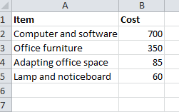
So here’s what I did. As a simple example, I decided to look at how a pie chart could represent the cost of items in a range of categories for a (fictional) home office.

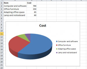
I can show this data in a more visual way using a chart. I can access charting options via the Insert ribbon. The first step is to decide on the kind of chart I want, so I’m opting for a pie chart to make it easier to compare the proportional costs involved.
So, I select the data above and then go to the Insert ribbon, and click on the Pie Chart icon. Because I’m feeling particularly brave, I’ve opted for the 3D pie chart…and it looks like this….

It is a basic example, but it proved to me how easy it was to insert a chart – it took less than a minute to do. Now…what can I chart next…