Data can be a powerful tool for driving business decisions, but a ‘sea of totally unrelated data’, when presented, can confuse your audience. However, you can make a huge impact by presenting that data clearly, using captivating visuals that tell a compelling story.
This guide will equip you with the skills to leverage the data visualisation tools readily available in Excel, turning your presentations from forgettable to phenomenal. By the end, you’ll be confidently creating stunning charts that impress your clients and leave a lasting impact.

From Bland to Boardroom-Ready: The Power of Storytelling with Charts
Have you ever endured a presentation where the data resembled a scrambled mess on a spreadsheet? Confusing your audience with an avalanche of numbers is a recipe for lost attention and diluted messages.
The good news is that clear and impactful communication doesn’t require complex solutions. By utilising Excel’s data visualisation tools, you can transform your presentations into engaging narratives that inform, persuade and inspire your clients.
Think of your data as the building blocks of a story, and charts as your visuals. These visuals guide your audience through a logical narrative, making complex information easier to digest.
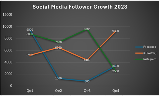
For instance, a marketing team presenting social media engagement metrics could ditch the bullet points and pie charts. Instead, a well-designed line graph could highlight follower growth across various platforms over time. This not only presents the data but also allows the team to delve into specific strategies that drove successful campaigns – see below:
Line Chart
Tailoring Charts for Maximum Impact
Understanding your audience is crucial for effective data visualisation. Consider their level of data literacy and tailor your charts accordingly.
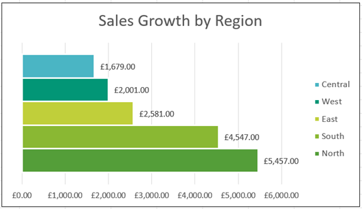
For audiences unfamiliar with complex charts, bar graphs and pie charts offer a clear and concise way to grasp key information. For example, if you are presenting sales figures to regional managers, a bar chart comparing sales growth across different territories would be an excellent choice, allowing for easy comparison and quick identification of top performers or areas requiring improvement. See Bar and Pie charts below – Note the same data is used but each chart type presents a different perspective:
Bar Chart
Pie Chart

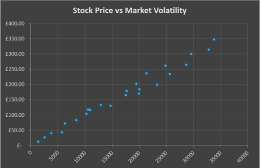
For more experienced viewers, consider using scatter plots or heat maps to reveal deeper relationships within the data. A financial analyst presenting risk assessments might utilise a scatter plot to demonstrate the correlation between stock prices and market volatility.
Scatter Chart
Always prioritise clarity over complexity. An overloaded chart can be confusing and counterproductive.
Excel: Your Gateway to Charting Mastery
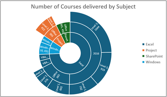
Excel boasts a comprehensive selection of chart types, allowing you to present your data in the most impactful way possible. Whether you need to display trends over time, highlight comparisons between categories, or reveal correlations, there’s a chart in Excel suited to your needs.
Sunburst Chart
Histogram Chart

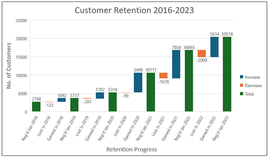
Waterfall Chart
Beyond choosing the right chart type, Excel empowers you to customise every aspect of your visuals. From colour palettes and fonts to data labels and gridlines, you can ensure your charts are not only informative but also visually appealing.
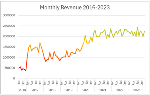
A strategic use of colour can significantly enhance the readability and impact of your charts. Imagine a sales manager presenting monthly revenue figures. Instead of a bland line chart, they could use a colour gradient to represent different sales targets. This would allow viewers to instantly see which sale at a particular point in time exceeded expectations and which fell short – see below:
Conclusion: From Dull to Dazzling: The Final Brushstrokes
By harnessing the power of data visualisation in Excel, you can transform dry data points into a captivating story that informs, engages, and inspires your clients. Craft a clear narrative, tailor your charts to your audience, and leverage Excel’s customisation features. Remember, a well-designed chart is worth a thousand spreadsheets.
The next time you’re preparing a presentation, ditch the text-heavy slides and embrace the magic of data visualisation. Leave your clients with a clear understanding and a lasting impression.
Further Reading:
If you’ve found this useful, and you want to learn more about the topic, feel free to read on!
Excel or Power BI. Which is Better for Business Reporting? – Blog