Categories
Power Apps Power BI Professional Development

Improve Communication of Data Using Power BI Dashboards

Dashboards are incredibly useful in helping business users gain insights into their data. In Power BI desktop the visualisations in a report are published to the cloud and then shared with key stakeholders in the Power BI service.

This blog will explain what a dashboard is and how reports, once they are published, can be turned into dashboards in order to enhance the end user experience and thereby increase productivity.

Why use Dashboards

Dashboards contain the most relevant charts and infographics and are more easily accessible than reports as there are fewer visualisations to interact with. This helps to focus end users in making important business decisions on the areas of the business that matter most.

Reports and Dashboards – what is the difference?

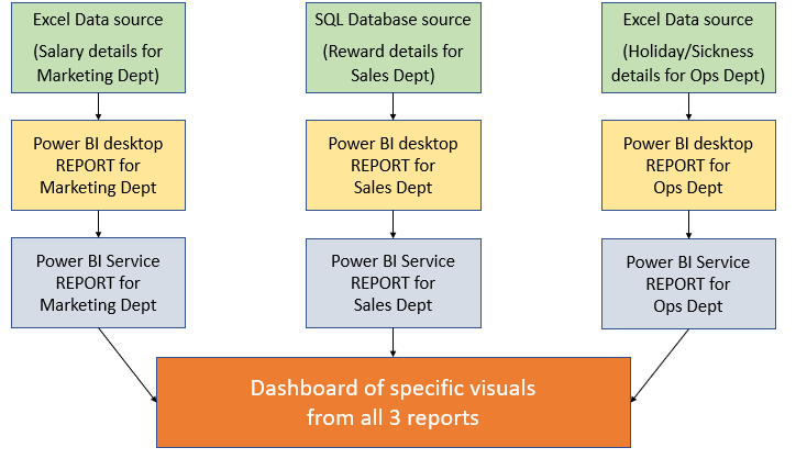
Reports and Dashboards in Power BI may appear to be the same thing when it comes to visualising data. However, they are different in the following way: A report is a collection of visualisations (e.g. charts, slicers, tables etc.) that can appear across multiple pages where all of the underlying data comes from a single data source. A dashboard, on the other hand, is a collection of visuals taken from different reports that have no connections between them where data is sourced from many locations. A good example is an HR dashboard containing different staff metrics to analyse – see below:


How to get started

  1. Log in to your Office 365 account in Power BI desktop
  2. From the Report page, go to HOME > PUBLISH
  3. Click on MY WORKSPACE and press SELECT
  4. Click on the ‘open file name’ link to open your report in Power BI service

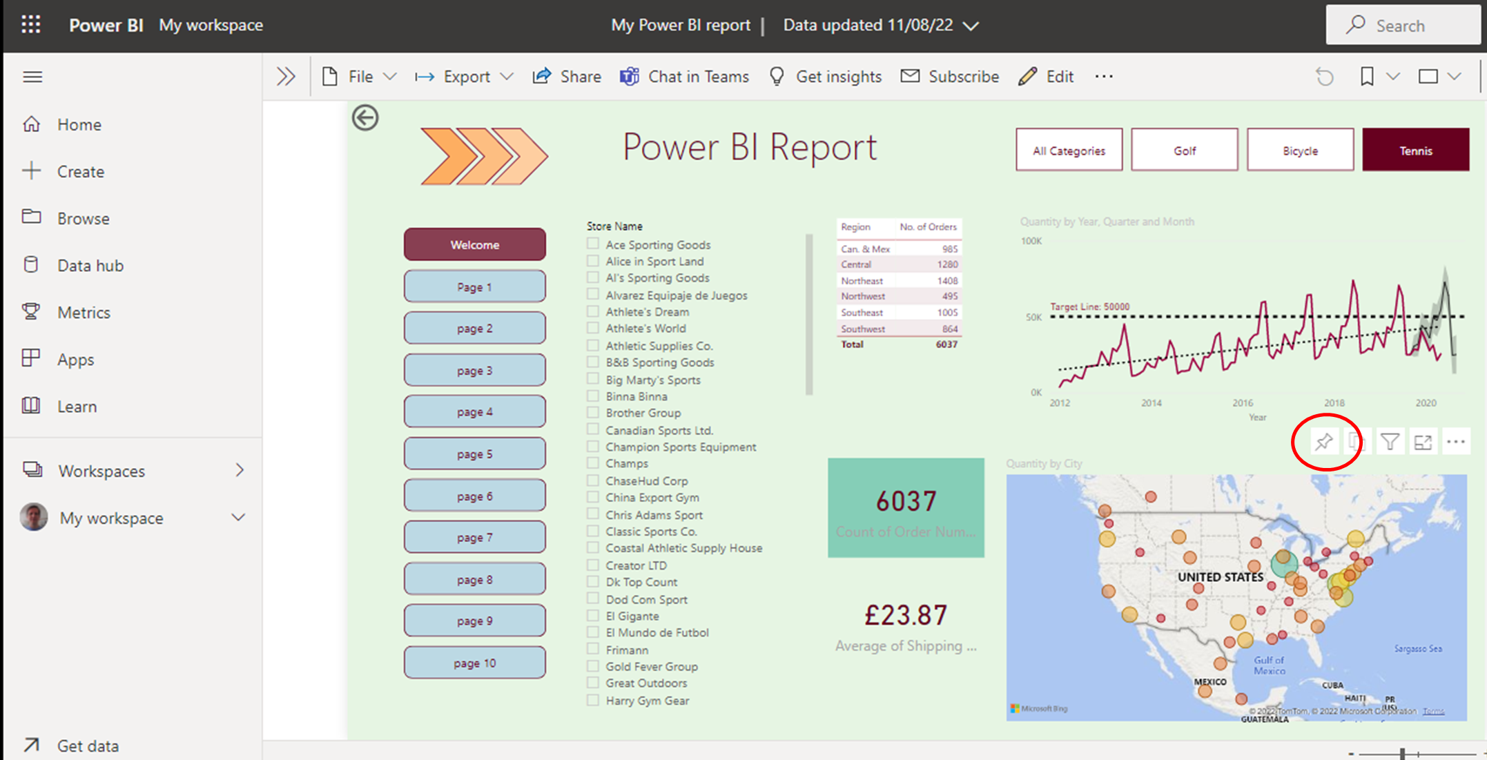
  1. To ‘pin’ a visual to a dashboard, hover over it to bring up a pin icon (see above)
  2. Click on the pin icon and choose where you would like to pin it (either existing or new dashboard)
  3. Click PIN and then click GO TO DASHBOARD

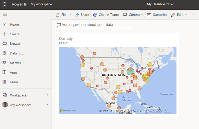
This action brings up the Dashboard area:

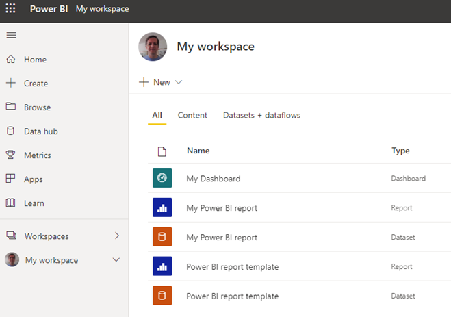
  1. To pin more visuals from different reports, click on MY WORKSPACE which is where you will find all previously published reports and recently created dashboards:
  2. There are 2 files listed by the same file name for each published file from Power BI desktop (see above). One is the Dataset (orange square) and the other is the Report (blue square)
  3. Click on the file name for the Report to open the report ready to pin another visual to the dashboard

Once you have pinned several visuals to your dashboard, you can then share to the various stakeholders:

Another benefit of dashboards is that you can click each pinned visual to navigate to the underlying report. This allows stakeholders to decide how much data they want to view.

Conclusion

Dashboards are clearly the ideal means by which to drive a business forward. By presenting Power BI reports as dashboards to your stakeholders, you are vastly improving the communication of data and reports which in turn will increase efficiency and profitability

For more information on dashboards, please click below:

https://www.forbes.com/sites/forbesbusinesscouncil/2022/06/02/the-three-dashboards-every-startup-ceo-needs/?sh=68de22123156


Categories
Power Apps Power BI

Track performance with Conditional Formatting in Power BI

Conditional Formatting is an amazing tool that allows you to track and monitor data more efficiently. It highlights information of interest. For many years, it has been the ‘go to’ tool in Excel, and now it is also available in Power BI desktop.

What is Conditional Formatting

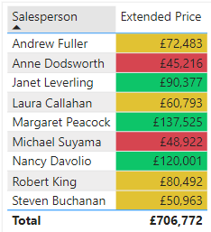
Conditional Formatting is based on setting rules on certain data and if any of this data meets this rule then it will change its appearance in some way e.g. display an icon or change colour (see below)

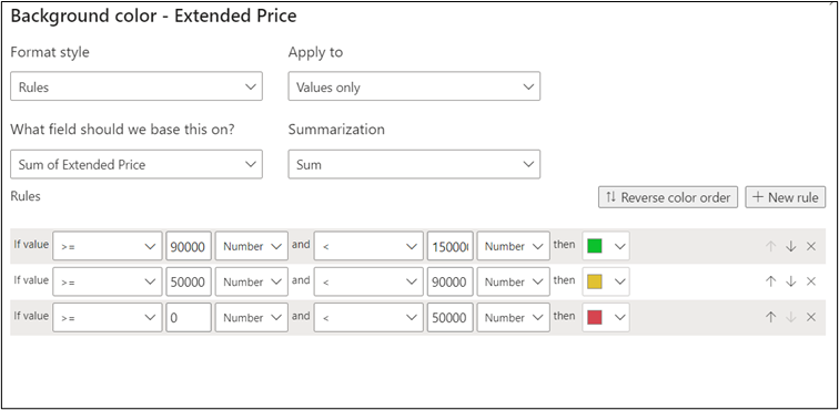
In this example, there are 3 separate rules all set according to specific bands or ranges of numbers. If a number falls into a specific band, then it will change to the appropriate colour. The world of finance has coined the term ‘RAG’ status – or Red, Amber, Green. Each colour  represents low, medium, and high numbers respectively. Whilst the Power BI desktop has many pre-set icons and colour ranges to help you to adopt this useful tracking system.

Why use Conditional Formatting

Power BI desktop is all about being able to analyse the latest data. Thanks to its powerful connections to the original data, Power BI can always display the most up-to-date data with Conditional Formatting. This makes it possible to see who or what is performing well/not so well in an instant. Simply by using the colours previously set. In a word, Conditional Formatting is ‘dynamic.’ Therefore it will always reflect the latest data if it happens to change at source level. This in itself will allow you to be more efficient in spotting key trends and performance indicators.

How to use Conditional Formatting

  1. In Power BI Desktop, import your data to analyse sales figures e.g. Extended Price for various items/products sold by a number of salespeople.
  2. In the Report View, create a Table visual to show the total Extended Price for each salesperson by dragging both Extended Price and Salesperson fields into the field well.


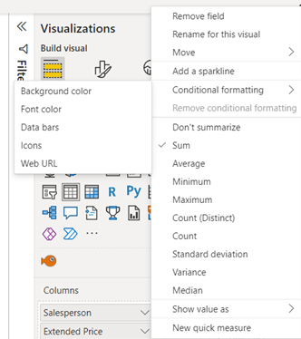
  1. Click on the Extended Price down arrow and select CONDITIONAL FORMATTING > BACKGROUND COLOUR.


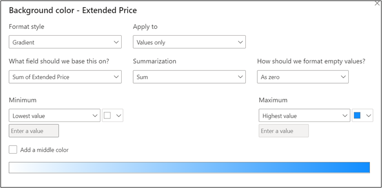
  1. Note the ‘Format Style’ is set to GRADIENT. For a simple colour distribution set your Maximum and Minimum colours – e.g. blue and white (see above) and click OK


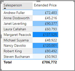
  1. The table below shows the figures from high to low using the blue to white gradient


This example is really quick. It is great for achieving a ‘rough and ready’ analysis. For a more precise method, you need to create rules to apply different colours to different bands just like the RAG status example shown at the beginning


  1. Create another table using the same visuals and select CONDITIONAL FORMATTING > BACKGROUND COLOURS as before


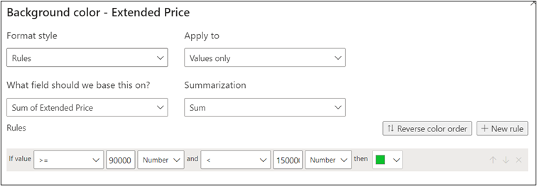
  1. Change ‘Format Style’ to RULES and enter values/colour as above. Click on the ‘add NEW RULE’ button


  1. Now add 2 more rules entering the following values/colours and click OK to apply the RAG colours to the visual


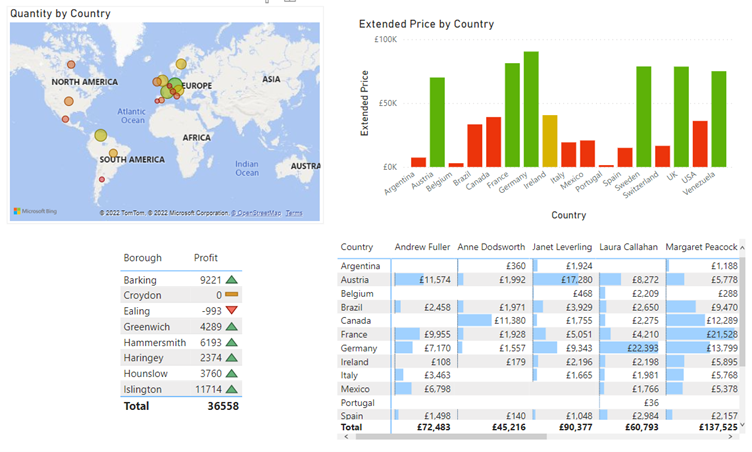
There are other ways to ‘tell your digital story’ through Conditional Formatting as seen below:

Conclusion

Conditional Formatting is a powerful tool that will help you become more efficient and productive in the process of tracking the most up-to-date performance figures .


If you’re interested, you can read more on Data Visualisation here.