Categories
Power BI

Become proficient in using Power BI themes

“A picture paints 1000 words”. This quote has been used to suggest that sharing information with graphics or imagery is easier to digest than written text alone.

The same is true with data – a mix of text and numbers is more user friendly when we present it using graphics.

graphics

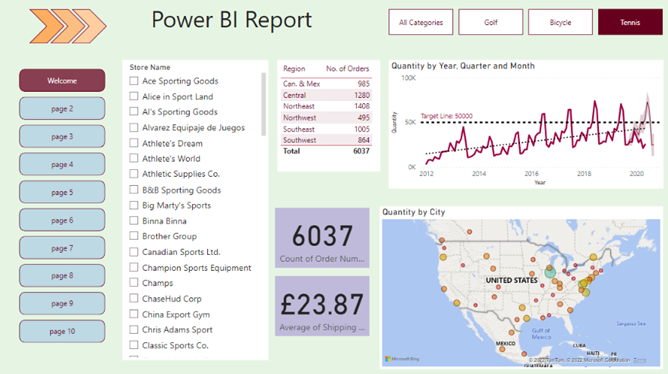
Power BI desktop has a whole suite of different visuals to choose from to represent the data to be analysed (see example below) and this blog will be looking at Power BI themes to enhance the appearance of your data reports. Consequently, end users will become more efficient and productive in their decision making.

graphics

What are Power BI Themes


Themes in Power BI allow you to set a colour palette that can achieve a consistent look and feel to your reports. By using themes, you can match reports to the colour branding of your organisation. This can help to convey your data more visually so that end users of the report can consume them more efficiently. Therefore you will gain useful insights in the process.


How Power BI Themes work


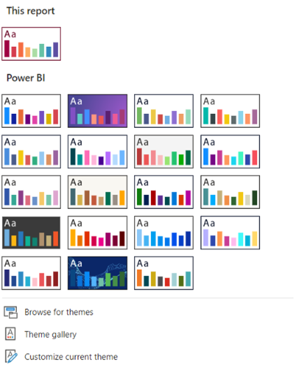
All Power BI desktop reports have a standard set of colour themes which you can easily apply to your reports:

On the report page click on the VIEW tab to show the top row of available themes. To show them all, click on the down arrow

graphics

The theme icon under ‘This report’ is the current theme and the others below are alternative themes that are available. Simply clicking on one those will convert your report to that theme which will then be at the top of the list.


If you want to adopt your organisation’s colour branding, you will need to ask your IT department to let you have access to a ‘JSON’ colour palette. JSON stands for Java Script Object Notation. It is simply a file format that Power BI will recognise when it is imported. To import:

    1. Go to BROWSE FOR THEMES in the themes list
    2. Locate the ‘json’ file by browsing to its location
    3. Click ‘Open’ which will import the theme

Now you can see your report’s colours have changed to reflect the imported theme. It is also top of the Theme list. To explore the colour palette within this theme you can set the background colour of one of your visuals:


1.Highlight a ‘Card visual’ and go to FORMAT ICON > GENERAL >                                  EFFECTS
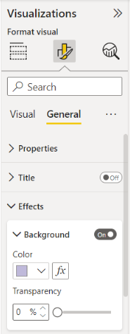
 

      1. Under EFFECTS make sure the background is turned on


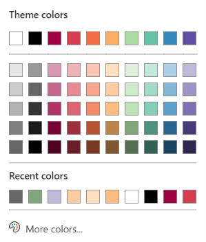
      1. Click on the down arrow for COLOUR to show the full

colour palette and select one of the coloured squares


Your chosen theme colours will be preserved after your report is published to the Power BI service.

Conclusion


Maintaining your organisation’s colour branding in your reports is key to conveying that all important corporate message. Power BI desktop, with its built-in themes and capacity to import custom themes, will definitely help you to achieve this goal.
Categories
Power Apps Power BI

Easily track performance with Analytical Lines in Power BI

The Analytics Pane in Power BI desktop is an amazing tool. You can use it to create a variety of different analytical lines inside your report visuals to highlight trends, target lines and forecasting.

This blog will explain how to create these analytical lines and show how useful they are in gaining insights into your data

Why use Analytics?

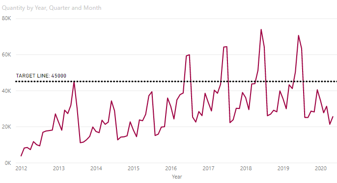
A report visual is great at representing key summary information such as the quantity of products sold every month. But what if you wanted to check how well your sales were meeting targets over time? You could manually look at each data point on a line chart, for example, but a more efficient solution would be to create a customised ‘target line’ within your line chart. This would instantly provide a visual which displays performance vs. target over a period of time. You will therefore become more efficient as you analyse the data. Below is an example:

How to get started


  • Create a line chart based on a value field over time e.g. ‘Quantity’ by ‘Order Date’


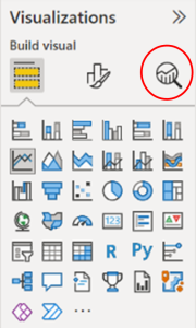
  1. With the chart selected, click on the ANALYTICS icon in the visualisation pane (see below)

  1. Expand the ‘Y-axis Constant Line’ section and click on ‘+ Add Line’
  2. Double click where it says ‘Y-axis Constant Line’ in the field and type TARGET LINE
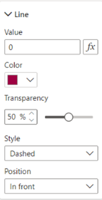
  3. Expand the ‘Line’ section to show the options below:

  1.  Set the following details to your line:
    1. VALUE to 45000
    2. COLOUR to Black, for example
    3. TRANSPARENCY to 0%
    4. STYLE to ‘Dotted’
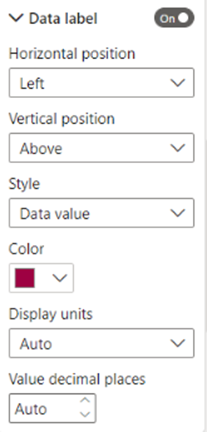
  2. Collapse the ‘Line’ section and turn on ‘Data label’ to reveal the expanded Data Label section:

  1.  Set the following label details to your line:
    1. STYLE to ‘Both’ i.e. both ‘Data Value’ and ‘Name’
    2. COLOUR to Black, for example
    3. DISPLAY UNITS to ‘Thousands’
    4. DECIMAL PLACES to 0

Other Analytical Lines

Notice in addition to the ‘Y-axis Constant Line,’ there are many other analytical lines you can apply to your visual some of which are described below:

  • TREND LINE: turn on to show an upwards/downwards trend – especially useful for analysing performance data over time
  • MIN LINE: click on ‘+ add line’ to show the lowest data point on a line chart – really helpful to identify the ‘bottom line’ of any business
  • FORECAST LINE: turn on to show a ‘projected’ line appearing after the last data point. This line can be set over an extended time period of your choice – great for any future business planning

Finally, the analytical lines are only available in specific visuals. They are:

  • LINE CHART
  • COLUMN CHART
  • BAR CHART

Conclusion

Trends, targets, and forecasting are one of many other analytical lines that can really enable you to track and monitor your performance data more efficiently. Using the Analytics pane in Power BI will definitely help to achieve this goal. This will enable you to work on your business’s profitability gains.