Categories
Excel Training

Understanding the different types of commands on the Ribbon

When I made the switch from Excel 2003 to Excel 2010, the Ribbon confused me and  it still takes me a while to figure out which tab holds the functions I need.  When I was on the intermediate Excel course the other week, I did notice that the trainer was talking about the buttons in different ways.

I felt it was time to devote a bit of time to learn about how to use the Ribbon more effectively including understanding the different types of commands.

ribbon-excel-vba-training
The Ribbon in its full glory.

Minimising the Ribbon I kept losing the Ribbon this week.  Didn’t know why, but it seemed to minimise on a whim.  That was until I learned that if I double-clicked on any tab, the Ribbon minimised.  To get it back, I needed to double-click on any tab again.   It is helpful to minimise the Ribbon when you want to see more rows (you can gain 5 more rows in the view if you minimise (not so helpful when you do this by accident and can’t work out what you did!)

Tip:  the shortcut to minimise the ribbon or bring it back to its full size, use Control and F1.

What are the types of commands on the Ribbon?  There are six main categories for commands: one-click, toggle, split buttons, drop-down and tick box.  Categories can be mixed so it is useful to understand the basics to develop your Excel skills.

The does-what-it-says-one-click button. These perform a simple action or function when you click on it. For example, clicking on the text alignment button applies the format to the active cell.  Other simple buttons in formatting include the Italic button, or bold, or increase or decrease font size buttons.

alignment-button-excel-vba-training
Click on the alignment button to format a cell in one click

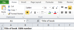
Toggle buttons, now this is pretty neat, and hadn’t spotted this until someone pointed it out to me.  Excel tells me when I’ve applied this button to a cell, by changing the colour of the button, so I can toggle between applying and deselecting. This is incredibly helpful when I have different formats applied to cells and I need a reminder, or want to deselect the format quickly.
toggle-excel-vba-training
In this example, my category headings have bold and bottom alignment applied, and the buttons are yellow to show me that.

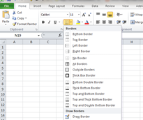
Drop down buttons have little arrows next to the button, reminding me that there are more options available.  A good example is the Borders button, which offers me different borders to apply to the cells I have selected.  Colour fill is another example, where I can click on the down arrow, select a colour and it is applied.
simple-button-borders-excel-vba-training
Drop down button options are displayed for me to select.

Split buttons are a hybrid of drop down buttons and one-click wonders.  So you can click on the button itself and the action is applied.  Click on the down arrow next to it, and more options are available and you can apply them from there.  You still have the benefit of the button changing colour so you know when an action is applied.

Tick box buttons are on/off kind of buttons.   A good example is in the View tab, where I can tick when I want to view gridlines, or show headings.  Quick to apply or deselect.

view-tab-tick-box-excel-vba-training
Tick box options in the View tab, so I can tick or untick actions such as show grid lines, or headings.

If you can’t remember what a button does, hold your mouse over the icon, and Excel will give the description.  If you use a button frequently, right click on it and add it to your Quick Access Toolbar, to save you from locating it on the ribbon each time.

The more familiar you get with the Ribbon, and the styles of buttons, the faster it will be to apply actions and functions.  By understanding the Ribbon better, I can also speed up my learning on courses – knowing the terms and locations makes it easier to follow exercises.  So I am focusing on understanding the commands and applying them so that I can move up to Excel VBA training soon.  For more background on the different skills and levels offered, have a look at https://www.stl-training.co.uk/microsoft/excel-training-london.php


Categories
Excel Training

What can I use Excel for?

This may seem a back-to-basics question, but it a useful one, at any stage of Excel.  This is something I’ve learned from attending our courses – it is always good to ask “What else can I do with Excel?”, “Can I automate that function?”, and “Can Excel do that?”

Excel is a spreadsheet and a versatile one at that.  It is fantastic for number-crunching and great for managing text data.  Excel functions such as sorting, filtering, charts and formulas allow you to analyse text and numerical data.  You can save time by automating functions such as calculations or conditional formatting, such as highlighting overdue invoices.

What can you use Excel for?  Well, everything from lists to charting progress and financial modelling.  Take a look at the list below and see if you are using Excel to the max.

Organising information with Excel
I know I can use Word to create a list but with Excel I have more scope to organise lists, categorise information, sort and filter lists, and set deadlines for items.  I use Excel for lists for work, home and even for study.

Excel for time management of work. I have an Excel sheet with the daily core tasks and project-based work.  This allows me to allocate time for each item, over the day, week, month and year.  I have the flexibility to manage tasks based on their priority, change time allocated and immediately see the impact of changing or adding tasks.  The lists includes text plus working with dates and currency (for costing up projects).

Excel for learning vocabulary in another language.  I use Excel to learn my French vocabulary.  I can colour code words by gender (using conditional formatting), add categories so I can filter lists by topic area.  I can even test myself by hiding words, typing in the word and Excel has a formula to say “correct” or “incorrect”.

Excel for Charts
Charts are useful for work and home.  Excel has ready-made tools so that I can create charts within a few clicks.  This is great for visual presentations of sales data, changes in customer demand, and income and expenditure figures by month or quarter.

Charts for monitoring sales performance.  Simple to set up, Excel can automatically update your chart to identify trends, highlight categories.  You can even embed these in your Powerpoint presentations – when you update your Excel sheet, the Powerpoint presentation is automatically up to date.

Charts for tracking weight and fitness measures.  You can customise an Excel worksheet so you can manage your health and fitness.  When you update your data, such as weight, time trials for stamina, or number of repetitions with weights, Excel charts can instantly show you the trends.  This can help you to tailor your training, by identifying potential over-training, spot trends in reduced performance and revise goals accordingly.

Number crunching
From Inland Revenue tax returns, to working out project costs, income and expenditure patterns, and client records, number-crunching is Excel’s strong point.  Never one for mental arithmetic, I can set up formulas in Excel so it automatically updates when I add new figures.  With formulas ready-made for me to customise, I can analyse data more quickly…so my focus is on outcomes, not on data entry.  Number-crunching is more accurate with Excel, with error and formula checking available with a click.  With Excel VBA you can set up and develop functions, debug codes and control program execution.  Number crunching covers everything from introductory level to advanced VBA.

Creating dashboards in Excel 
I have Excel workbooks with many worksheets and creating a dashboard in Excel allows me to have a summary of all the key data in one sheet in a clear format.  I can set it up to automatically update with figures from other worksheets, or even other workbooks.  Fantastic for sharing data with colleagues, dashboards provide an immediate overview so that discussions are based on accurate and current data.

Excel for creating diagrams and adding graphics  
Maybe this isn’t the most common use of Excel but diagrams and graphics in Excel can give your work the wow factor.  It is a great way to tailor information to suit your audience, for example, those who need more visual representations of numbers through diagrams or charts.  If your audience includes everyone from HR to Finance, your Excel worksheet can include graphics to show project staffing to assessing the return on investment. I can even add a screenshot if I want…Excel really is that versatile.

Graphic items can add a professional edge to your workbook and enhance the content in your worksheets.  SmartArt graphics such as organisational charts or process diagrams can complete an Excel project proposal, with the financial data linked to the project processes shown in a diagram next to the figures.  Remember, graphics can include your organisation’s branding – a quick way to customise your documents.

Save time by automating complicated tasks in Excel 
Possibly my favourite thing about Excel.  Once I have figured out that I can automate a task, Excel can do the leg work for me.  Automating tasks can include using macros, using formulas, or conditional formats.  For example, I can update my time sheet  and Excel will automatically update the figures for my invoice, or project monitoring worksheet.  With 3D formulas, I can link calculations across my workbook or even other Excel worksheets – cutting out the need to update several documents with the same data.

It doesn’t matter if you are new to Excel or an experienced user, you can always get more out of the program by asking questions, experimenting with formulas and developing more complex skills using VBA Excel or PowerPivot.  Take a peek at what you can learn at https://www.stl-training.co.uk/excel-vba-2010-training-course.php.