DAX (Data Analysis eXpressions) is the function language in Power BI desktop. When DAX is used to create measures, it can hard to understand the logic sometimes. Especially one function, the Calculate function, can be challenging.
This is the second part of a series of blog posts, which will investigate the mysterious Calculate function.
It reacts differently to row, column, filter, and table context than the other DAX functions, and will be needed for nesting a number of DAX functions.
In this blog post you will see some examples of how the calculate function works in filter context.
Matrix visual
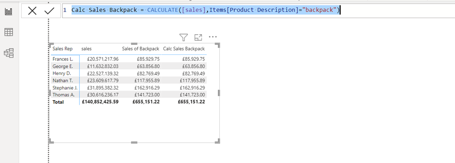
In the example below, you can see sales in a matrix visual. The visual displays total sales for each sales rep, and sales for a specific product. In this example, backpacks are the product.
In the example the sales have been filtered and calculated by using the SUMX function.
Sales of Backpack = sumx(filter(Line_Items,RELATED(Items[Product Description])=”backpack”),[sales])
To do it with the SUMX function, you need to use the FILTER function. We need a Related function to reference the column in the Items table, and the expression is the measured total sales.
Now Using the Calculate Function
Now let us see how to do the same, but this time with the mysterious Calculate function.
Calc Sales Backpack = CALCULATE([sales],Items[Product Description]=”backpack”)
You can now do it with only one function – the Calculate function. This means that you will not need to use the Filter function to filter by the product, and you will no longer need to use the Related function.
See the matrix below. The Calculate measure returns exactly the same as the SUMX measure.
But the mysterious Calculate function can behave may be a way which seems illogical.
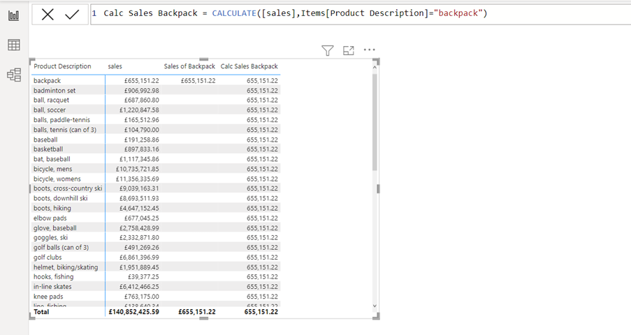
Below the matrix has been amended to display sales by product instead of sales rep.
Now the Calculate measure, as you can see above, cannot understand that it needs to filter the table by each product. The SUMX measure can. The Calculate measure just shows the same sales of backpack total for all the products, but it does not sum up all the values in the Total row at the bottom of the matrix.
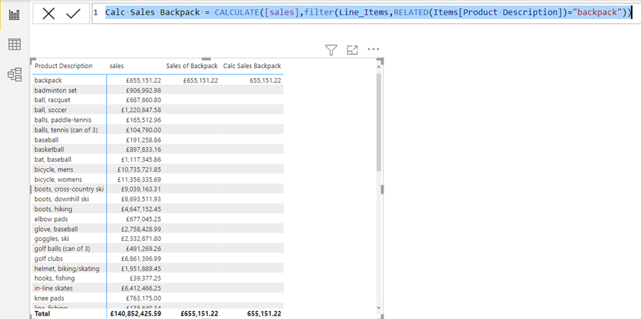
To get the Calculate function to return the right result, a Filter and a Related function are needed.
Calc Sales Backpack = CALCULATE([sales],filter(Line_Items,RELATED(Items[Product Description])=”backpack”))
Above you can see that the amendment of the Calculate function now shows the expected result.
But can this special behaviour be useful?
You could be in a situation, where you want to compare the sales of backpack up against the other products. Following on, the next example shows a percentage difference of backpack sales versus other products which needs to be visualised.
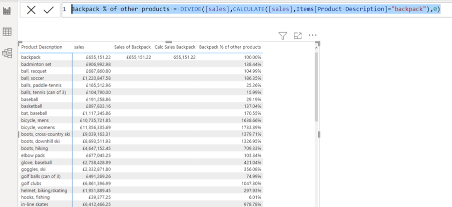
Backpack % of other products = DIVIDE([sales],CALCULATE([sales],Items[Product Description]=”backpack”),0)
The measure above will do the job. The Calculate measure without the Filter function or the Related function will return the total sales of backpack in each other product’s rows in the matrix. So that sales for each product will be measured against the sales of backpacks.
Above you can see the result of this approach, and of course the percentage difference from backpack and backpack will return 100%.
Conclusion
I call the Calculate function the mother of all DAX functions. It is the most important DAX function (my personal opinion), but to get the most out of it you will need to understand, how the function reacts to row, column, filter, and table context.
In the next blog post in this series, you will see how the mysterious function is needed for use of date intelligence in Power BI desktop measures.


