Categories
Application Microsoft Technology

Microsoft’s Power BI – what you can expect in 2019

Our FEBUARY Power BI blog had some great insights and tips into creating power bi tooltips – so what else is new for Power BI?
Python Visuals

In February 2019, Microsoft have announced an update of Power BI where you can now share, publish and view Python visuals in your reports and dashboards.

This update extends the support for Python in the Power BI Desktop to the Power BI service, which was written by Mohammed Ali, a Power BI Program Manager at Microsoft in August 2018.

This ability completes the support for Python in Power BI, enabling you to use Python scripts to prepare your dataset. It also allows you to apply slick analytics or machine learning in the Power BI Desktop and personal gateway.

You can then plot the results in your Power BI reports using any of the hundreds of open-source Python Visualisation Packages.

Incremental Refresh

Incremental refresh is a new feature of Power BI premium which enables more reliable and more efficient resource consumption.

It’s also completed refreshes faster on larger volume datasets.

Part of Microsoft’s strategy is to converge enterprise on Power BI on a single platform lead to the announcement of the public preview of incremental refresh in July 2018.

It’s a fine example of how Power BI is simplifying complicated implementations.

This allows the incremental loading of new or changed data without the need to reload the entire data list.

The benefits of this new process means faster refreshing times and less memory used during processing, older data can be dropped as it is no longer required and refreshes are ultimately more reliable.

Embedded Analytics

Here is a brief list of the updates made available for embedded analytics:

Use Power BI with service principle

Schedule Refresh API

Get Power BI Apps content

Embed Capabilities:

Control all visual menus programmatically

Personalise reports from Themes API

Clone Visual API

These are some of the most anticipated updates for Power BI this year and stay tuned for further posts on additional Power BI updates throughout 2019.
 

Categories
Application Hints & Tips Microsoft Microsoft Office Technology

Using Excel to build a simple dashboard

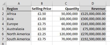
Excel charts are great visual tools to show changes in data. You can build dynamic charts in Excel with a few easy steps. Below is an example of a table which can be used to build an interactive chart.

Basic data

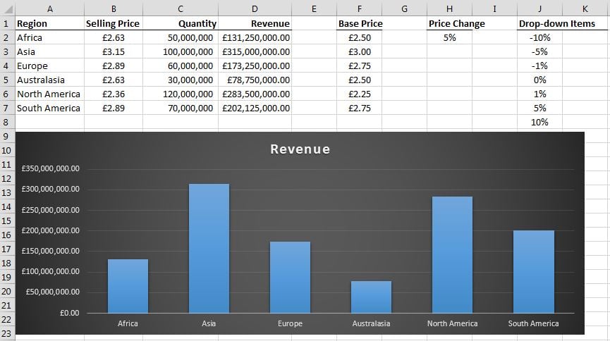
The Quantity column’s values are simply entered into the cells, but the Revenue figures are the result of the formula =B2*C2, which is copied down the column. The Selling Price is generated by multiplying the Base Price (see below) with the Price Change showing in the drop-down list in H2 (also shown below, but more about the drop-down list later). The formula is: =F2+F2*$H$2. The $ symbols in the formula are used to lock the percentage in the formula when you copy it down, because it is only in the one cell.

Base & dropdown

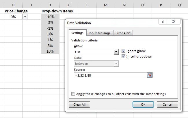
Select cell H2. To create the drop-down list, you need to have a normal list entered into some cells beforehand, as shown below. The drop-down is created by clicking the Data tab, then clicking Data Validation. In the box, select List from the Allow drop-down. Next, click inside the Source field, then select the list of figures in the cells (J2:J8 in this example). Now you have a drop-down list in cell H2.

Drop-down

As shown earlier, the figure shown in the drop-down cell (H2) is linked into the formula calculating the Selling Price. You can now change the Selling Price using the drop-down. And because the Selling Price is linked to the Revenue by a formula, these numbers also change!

The final step is inserting a chart which shows the Regions and their Revenues. To do this, first select the regions (including the label). Then hold down the Ctrl button and also select the revenue figures, again including the label.

Select columns

Now click the Insert tab, then click the Clustered Column option. This will insert a clustered column chart into your spreadsheet.

Charts

Move the chart to a suitable spot in your sheet, then test the drop-down list. See the magic happen as the chart changes when you select different values in the drop-down list!

Final

Excel course is one of our Microsoft Office 365 training courses.