Categories
Microsoft Project Training

Create amazing Reports with Microsoft Project

When managing a project using Microsoft Project, stakeholders often need to receive progress updates. Because not everyone can read a Gantt chart, MS Project comes with a set of pre-designed reports and dashboards to help you better understand your data. You can easily create amazing reports with Microsoft Project. Below is an explanation of the different types of report that can be created.

Dashboard Report Types

Project Reports

Burndown

How much is completed on a project and what’s left to be done.

Cost Overview

The current status of top level tasks showing planned, remaining costs and cumulative costs.

Project Overview

How much of your project is complete, upcoming milestones, and tasks that are past due.

Upcoming tasks

The work that has been done in the current week, the status of any remaining tasks that were due, and what tasks are starting in the next week.

Other Report Types

Cash Flow

The cost and cumulative cost per quarter for all top level (summary) tasks.

Resource Cost Overview

The cost status of work resources showing cost details in a table and a chart showing cost distribution.

New Reports from templates

Chart
A chart for your project data, showing actual work, remaining work, and work by default.

Table
A table for your project data, showing the Name, Start, Finish, and % Complete fields.

Comparison
Two charts side-by-side, showing the same project data.

Visual Reports

View visual reports instantly in Excel or Visio

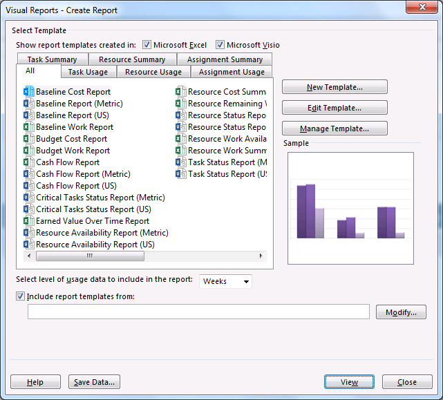
In MS Project, you can also view specific project data as a visual report in Excel or Visio, if you have those programs installed. Select Reports, Visual Reports, select an Excel or Visio report for your project data, and click View. Excel builds a local Online Analytical Processing (OLAP) cube file and shows your data in an Excel PivotChart or Visio PivotDiagram. This is a legacy feature from MS Project 2010 and earlier.

MS Project Visual Reports

Examples of Reports

Here are a few visual examples based on a sample project.

Cost Overview

Create amazing Reports with Microsoft Project

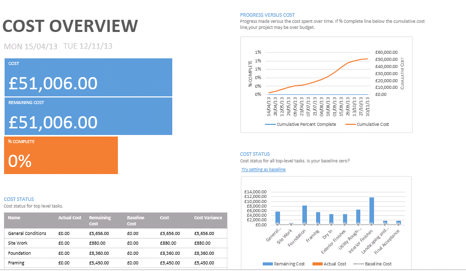
The Cost Overview report shows the following:

  • Costs, Remaining Costs and % complete.
  • A chart of cumulative costs.
  • A chart of cost status for top level tasks.
  • A cost status table for top level tasks.

Reporting changes to a project

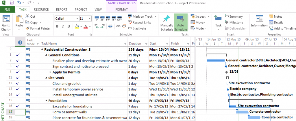
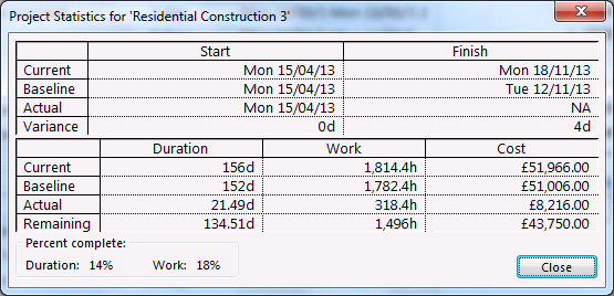
In the same example, the first two phases of the project were completed as planned. There is a delay of 4 days with excavation due to bad weather.  The project plan shows which tasks are complete.

Gantt Chart

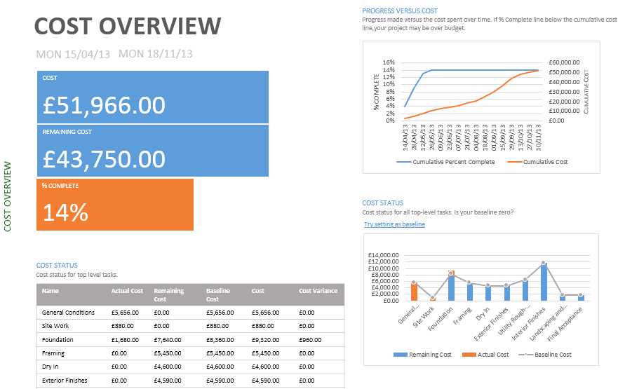
The Cost Overview Report now reflects the changes made and shows the project as 14% complete. The Cost Status table identifies the cost variance for the Foundation phase.

Create amazing Reports with Microsoft Project

Project Statistics

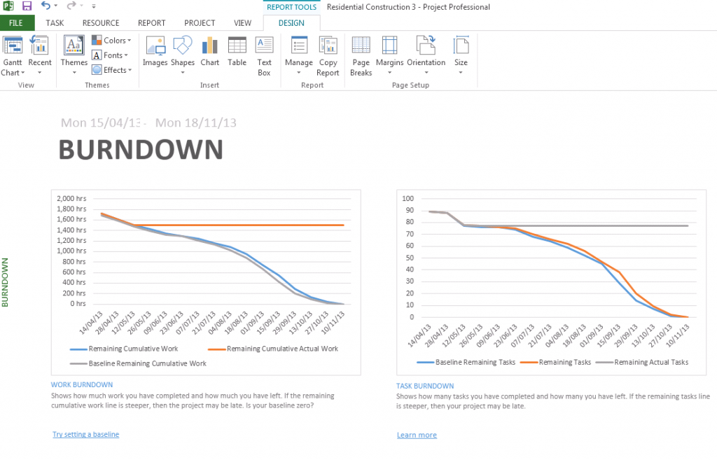
Burndown

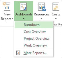
Select Report, Dashboard, Burndown to show graphically how much work and how many tasks are completed as well as what’s left to be done.

Create amazing Reports with Microsoft Project

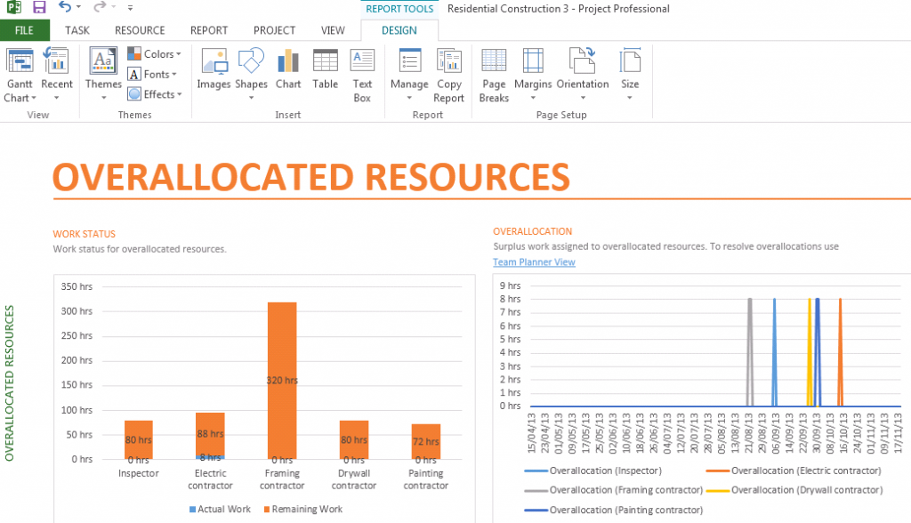
Overallocated Resources Report

Select Report, Resources, Overallocated Resources to identify which resources are overallocated and at what points in the project. This is a great way of seeing where unnecessary costs are being lost.

Overallocated Resources

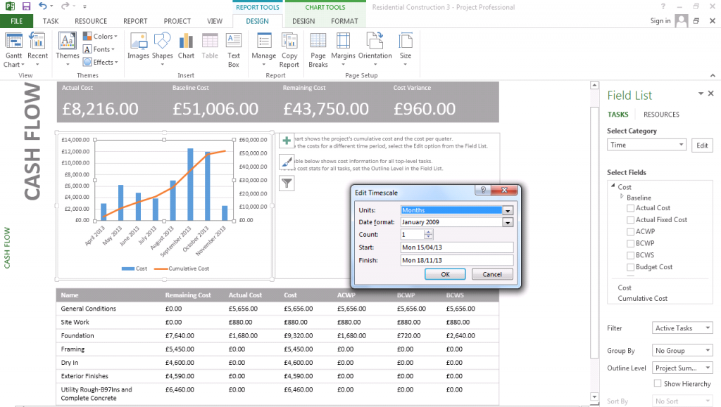
Cashflow Report

Being able to report and analyse your cash flow visually is a great way to track the spend of a project. It also makes the data digestible and ideal for sharing with clients and colleagues via email or PowerPoint presentation.

Select Reports, Cost, Cash Flow to see a chart and table of the project cash flow.

To change the timescale of the report from quarters to months:

Select the chart, click the Edit button for the Time category in Field List and choose Months.

Cash Flow

To learn how you can create amazing reports and project plans with Microsoft Project, why not consider an STL training course on Microsoft Project.
Categories
Application Data Visualisation Microsoft Power BI

Everybody should be using Power BI – 10 Reasons Why

What is Power bi?

Perhaps you have heard it said that everybody should be using Power BI. But what is it, exactly? Power BI is a collection of software services, apps, and connectors. These work together to turn unrelated data sources into coherent, visually immersive, and interactive insights.

The application consists of several elements that all work together, starting with these three basics:

  • A Windows desktop application
  • An online SaaS (Software as a Service) service
  • Mobile apps for Windows, iOS, and Android devices

Built on Excel technology, the application will feel familiar to more advanced Excel users. You create visualisations in much the same way as you do with Pivot Tables. Power BI will make you much more productive  in your data analysis and reporting. This increased efficiency will lead to greater profitability.

everybody should be using power bi

Power BI is easy to use and it’s cheap to train users

It’s intuitive and easy to learn for most users. The training costs are low and learner adoption is rapid.

 it has free mobile apps

Microsoft have released mobile applications that are free for Windows, Apple, and Android.

You can subscribe via email

Most of us would like a static report to appear in our inbox every morning when we power up. All you need to do is to go to your report tab, click ‘subscribe via email’.  You will then receive a nicely formatted PDF document, ready for printing. However, these reports are so much better when you have full interactivity.

it can be embedded into your own custom apps

When working from the ground up, you’ll always have the option of designing your own architecture around it. So, if you want to build your own website and set user access via your own login credentials, this will be no problem for Microsoft.

it is extremely competitively priced

It’s free to try for as long as you want. However, if you want to take advantage of all the enterprise features such as automatic refreshes, controlled sharing of data, then all you have to pay is a mere $9.99 per month.

Power bi has a modelling engine that power users can learn

Microsoft is conveniently enabling a culture of self-service which is breeding a new generation of ‘developers’. Power BI uses a language called DAX (Data Analysis Expressions); this is a functional language that can easily be learned by Excel professionals.

The application has data loading tools that power users can learn

Power Query, which is also built into Excel, is so easy to use, it’s almost embarrassing to the skilled developers out there.

Power BI provides self-service Business Intelligence

The app is self-service Business Intelligence personified. Any competent Excel user can learn to use the tools, allowing them to become semi self-sufficient in their analytics and reporting.

it is an Enterprise-strength tool

Power BI has the foundation to be an enterprise-strength tool. No matter the size or complexity of your enterprise, the application is able to process your data.

consolidation dashboards

Among other things, Power BI is  a data source aggregator. It doesn’t matter where the data originates from, all you have to do is to click on a visualisation to view the information.

It is time for you to invest in Power BI, both the software and the training!