In conversation with one of our Excel / Power BI trainers.
In this post, we sit down with one of our training delivery team to look at the pros and cons of Power Query in Excel, as a new way of working with data.
Jens, how would you describe Power Query in Excel in one word?
MAGIC!
That has my attention! How has Power Query changed the way you work with data?
When I started using Power Query five years ago, I was blown away. This tool has completely changed my way of working in Excel.
Power Query has reduced the time I spend in Excel dramatically and has minimised or removed boring repetitive tasks. This has allowed me to gain an elevated level of efficiency. Power Query has also minimised my use of VBA coding in Excel.

So, how does Power Query work?
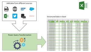
One might see Power Query as a machine. Once you have built the “machine”, it will continuously repeat the tasks for any new data added to Excel. It is a much easier alternative to automating processes than VBA programming because the Power Query does not need coding.
Sounds good! What are the most useful key features of Power Query?
With Power Query you can:
- Connect live to an external data source
- Structure internal and external data
- Clean, merge, append, and group internal and external data
- Automate tasks
- Transfer data from the query connection to the Excel data model
Let me explain each of these points:
Connect live to an external data source
You will find the tools to connect to external data on the Data tab in Excel, in the Get & Transform Data group. I normally tell my clients that you can connect to any live data if you have legal access to the external data. You may need to get help from your IT department to connect to your source. However, once you have created the connection, you can create your reports, analysis, or dashboards. They will auto update when you add new data to the source.
You can also connect to a folder, which is extremely useful if you receive data from clients. If you connect Power Query to a folder, the only thing you will have to do when you receive a new file, is to drop it in the folder you have connected to. Your report, dashboard, or analysis will update and include the new data from the added file.
Structure internal and external data
Through my work as an Excel trainer, I often notice how users struggle with badly structured source data in Excel. If the data is structured incorrectly, everything gets much more complicated and time consuming.
Excel prefers data in lists. You should arrange all source data in well-structured lists.
It does not really matter how you structure your data is initially. Power Query can restructure your data sets and when you have set up the query, the “machine” will restructure newly added data automatically.
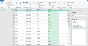
The Power Query Editor:

Clean, merge, append, and group internal and external data
Have you been in a situation where US dates, extra spaces, unprintable characters, spelling mistakes, empty rows and columns, incorrect formatting, or hundreds of other issues, have caused you endless cleaning work in Excel? Then Power Query is the right tool for you. And again, when the query is set up to do the job, it will do it for all data added in future.
Power Query can merge any number of tables. Say goodbye to complicated and memory-heavy lookup and reference functions.
Connect to multiple lists and turn them all into one list by using the Append option in Power Query.
The Group Data tool in Power Query can replace Pivot Tables and the Subtotal tool in Excel but is also an extremely useful part of the Merge Data tool which generates related keys between tables.
All the tools in Power Query are available both for external and internal data.
Automate tasks
Like the macro recorder in Excel, Power Query records the steps you do in your data sets and writes code in a language called Power Query M.
Code example:

One of the differences between macros and Power Query is the way Power Query executes the code. Recorded macros will only run on a user command. Power Query M will automatically execute the steps every time.
Transfer data from the query connection to the Excel data model
Excel has a limit of just over a million rows per sheet. However, the number of rows you can add to the memory of the Data Model is almost unlimited. Few Excel users are aware of the data modelling tool called Power Pivot. Not only can it store billions of records, but also, the compression technology Microsoft has developed for this tool is outstanding.
If you are working with huge data sets, then using Power Query and Power Pivot together is a winning combination. You can connect to huge data sets, clean, structure, merge and append your data in Power Query. Afterwards, you can transfer the data to the Excel data model and relate the data sets.
I am not saying it is easy, but a good understanding of databases, Vlookup, and Pivot Tables can be particularly useful towards understanding related data.
Are there any cons to using Power Query, Jens?
I called this article “The Pros and Cons of Power Query” but after five years of using the app, I have seen only pros.
All Excel users above a basic level should get a good understanding of this tool. It will change how they use Excel. For most users it will also have a massive impact on the time spent in Excel.
How would you summarise the pros and cons?
Pros:
- A positive impact on the efficiency of Excel tasks
- Removal of boring time-consuming repetitive tasks
- Automation of tasks without complicated VBA codes
- Improved data quality and structure
Cons:
None!
Thanks, Jens, for an excellent explanation of the pros and cons of Power Query. To be honest, I can see only pros!
