“A picture paints 1000 words”. This quote has been used to suggest that sharing information with graphics or imagery is easier to digest than written text alone.
The same is true with data – a mix of text and numbers is more user friendly when we present it using graphics.

Power BI desktop has a whole suite of different visuals to choose from to represent the data to be analysed (see example below) and this blog will be looking at Power BI themes to enhance the appearance of your data reports. Consequently, end users will become more efficient and productive in their decision making.

What are Power BI Themes
Themes in Power BI allow you to set a colour palette that can achieve a consistent look and feel to your reports. By using themes, you can match reports to the colour branding of your organisation. This can help to convey your data more visually so that end users of the report can consume them more efficiently. Therefore you will gain useful insights in the process.
How Power BI Themes work
All Power BI desktop reports have a standard set of colour themes which you can easily apply to your reports:
On the report page click on the VIEW tab to show the top row of available themes. To show them all, click on the down arrow

The theme icon under ‘This report’ is the current theme and the others below are alternative themes that are available. Simply clicking on one those will convert your report to that theme which will then be at the top of the list.
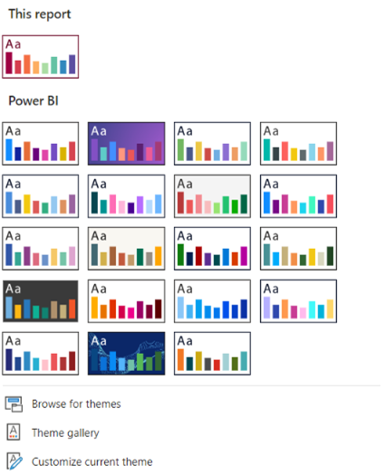
If you want to adopt your organisation’s colour branding, you will need to ask your IT department to let you have access to a ‘JSON’ colour palette. JSON stands for Java Script Object Notation. It is simply a file format that Power BI will recognise when it is imported. To import:
-
- Go to BROWSE FOR THEMES in the themes list
- Locate the ‘json’ file by browsing to its location
- Click ‘Open’ which will import the theme
Now you can see your report’s colours have changed to reflect the imported theme. It is also top of the Theme list. To explore the colour palette within this theme you can set the background colour of one of your visuals:
1.Highlight a ‘Card visual’ and go to FORMAT ICON > GENERAL > 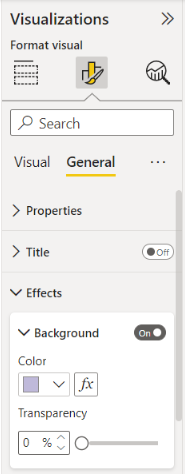 EFFECTS
-
-
- Under EFFECTS make sure the background is turned on
-
-
-
- Click on the down arrow for COLOUR to show the full
-
colour palette and select one of the coloured squares
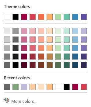
Your chosen theme colours will be preserved after your report is published to the Power BI service.
Conclusion
Maintaining your organisation’s colour branding in your reports is key to conveying that all important corporate message. Power BI desktop, with its built-in themes and capacity to import custom themes, will definitely help you to achieve this goal.